Maxis Consumers
A full design cycle redesign of a GM enterprise tool
Maxis Consumers is an enterprise tool at General Motors, used to let users request access and view reports, tables, and charts, as well as creating Meetups and downloading data dictionaries. Due to shifting priorities from the organization, Consumers had been left without changes for months. When I joined the team, after working on the Maxis Workspaces project first, I was asked to conduct a heuristic evaluation of the site. I noted any bugs and general problems I had with functionality and navigating the site. This led to a design cycle to make improvements to the tool. For this project, I was one of three UX designers, we each conducted user research too. The project lasted about 3 months.
Select the expand button at the top of each set of wireframes to get a better view if needed.
Heuristic Evaluation
I wrote down several tasks the user would want to complete by using the tool, such as creating an event/meetup, finding a report, requesting access to a report, and favoriting a report or application. Along the way of each task, I wrote down any bugs and errors I was facing, such as pop ups not being in view and certain screens not working zoomed in. Along with functionality, I noted improvements that I would like to see on the website, like a more concise form to create events.
Once all three of us designers went through the entire tool, we shared and wrote down everything we found. Then, we prioritized the issues we wanted to address, based on how much impact we thought they had on users and how important they were to address, as well as their feasibility. After deciding on some of the top issues, we planned a usability study, to ensure we addressed the users’ pain points and see if there were other issues we missed.
Usability Testing
To begin, my team and I wrote a script with a few tasks and directions on where to navigate. We also asked about any similar products they use and any other feedback they had about our product at the end of the session.
We recruited users by asking our developers for a list of power users who accessed the site most often. I moderated and took notes for 12 usability tests.
After all sessions were completed, we added all our notes and summarized them in a FigJam board.
We created 2 personas, based on our users’ roles, what features they used most, and their goals for using them. This helped us summarize our notes, empathize with users, and prioritize changes we should make.
To help visualize the user’s feelings, we created charts showing the persona’s emotions during each step of the different features, and what improvements we could make for them.
.png)
.png)
.png)
.png)
.png)
Lastly, we created the list of prioritized changes and discussed it with our managers and some of the developers on the team, to confirm which ones were important and feasible.
Inspiration
After analyzing the results and list of changes we wanted to make, we gathered some research and screenshots of designs and products to inspire our designs. We looked at some products users mentioned liking too. The other designers and I all shared the images we found with each other, so we could all continue getting new ideas for when we start designing.
Low-fidelity designs
Once we gathered our inspo, each of us designed at least 1 option for each feature we wanted to update.
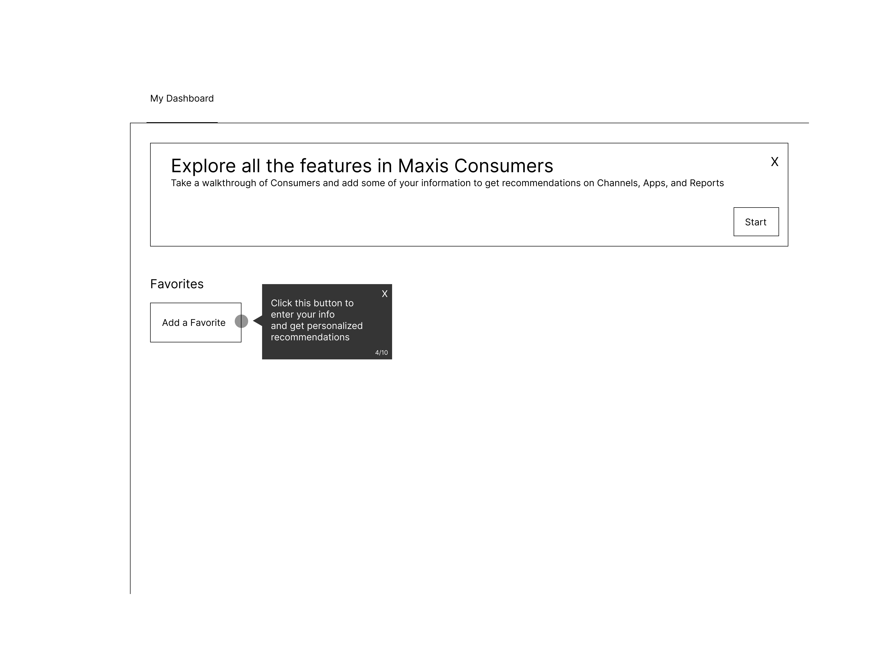
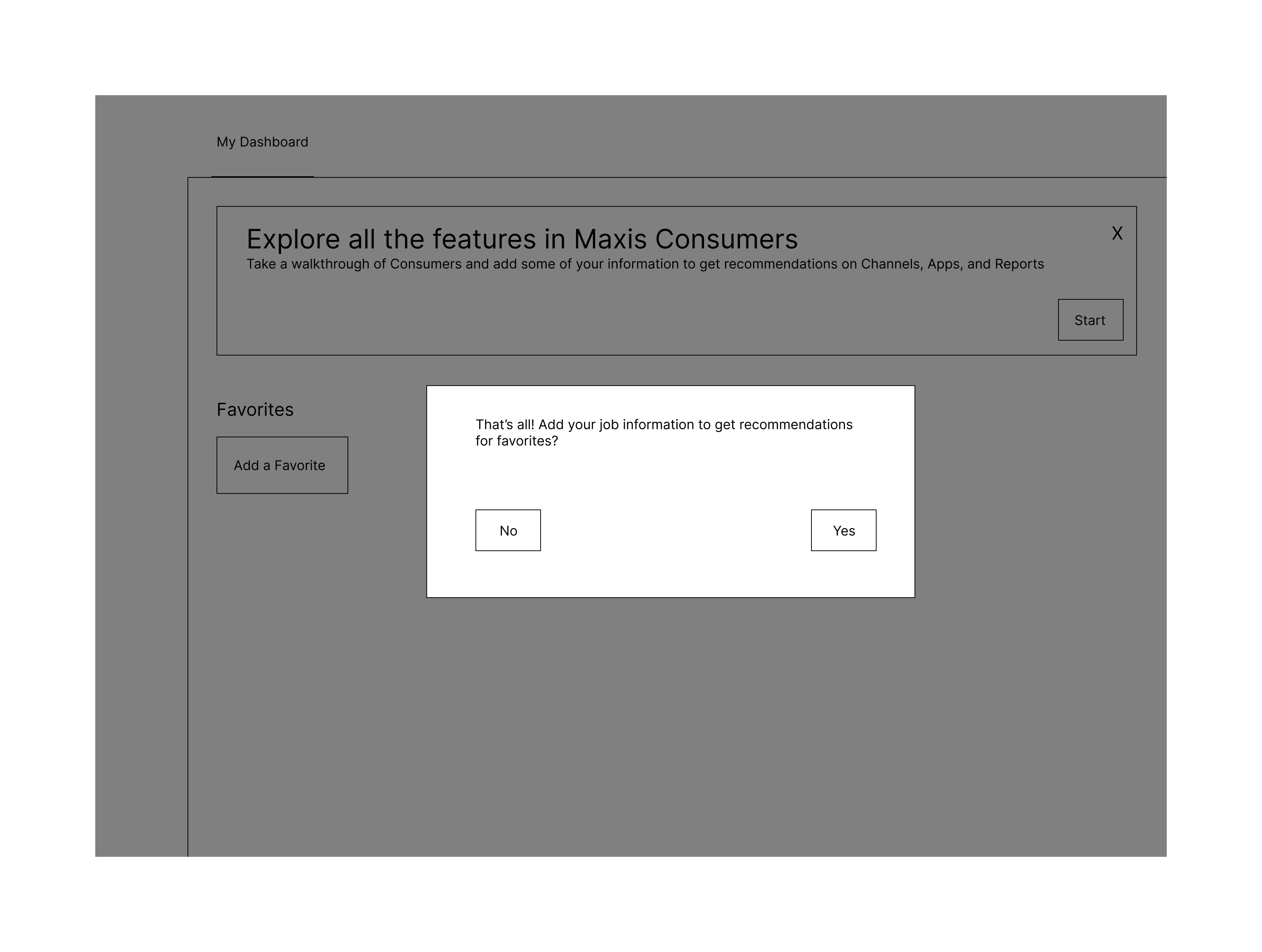
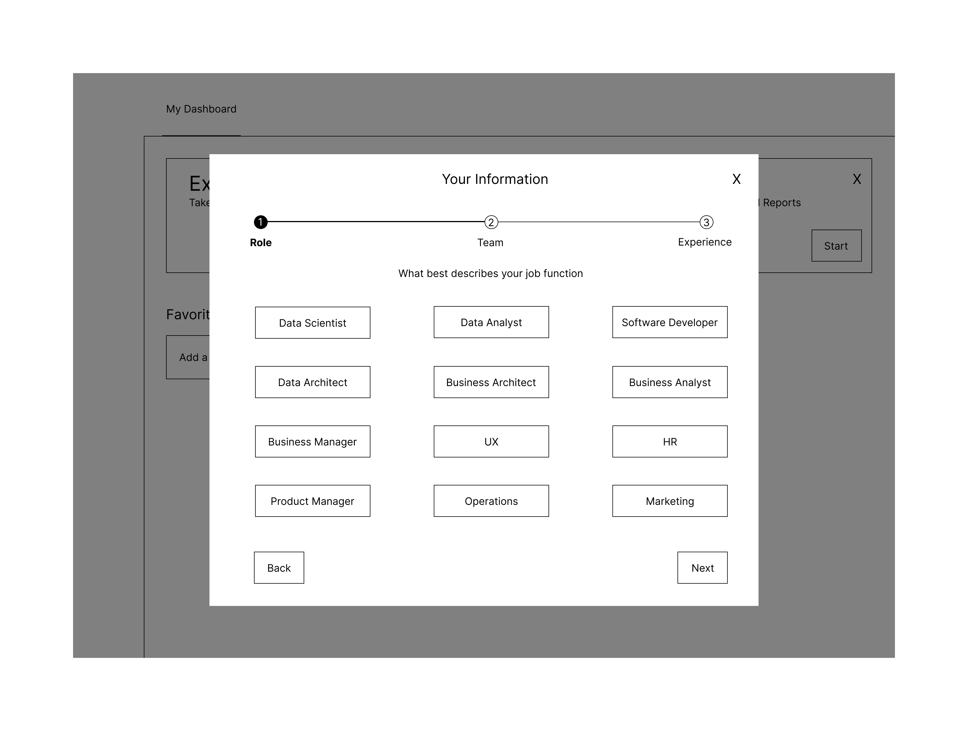
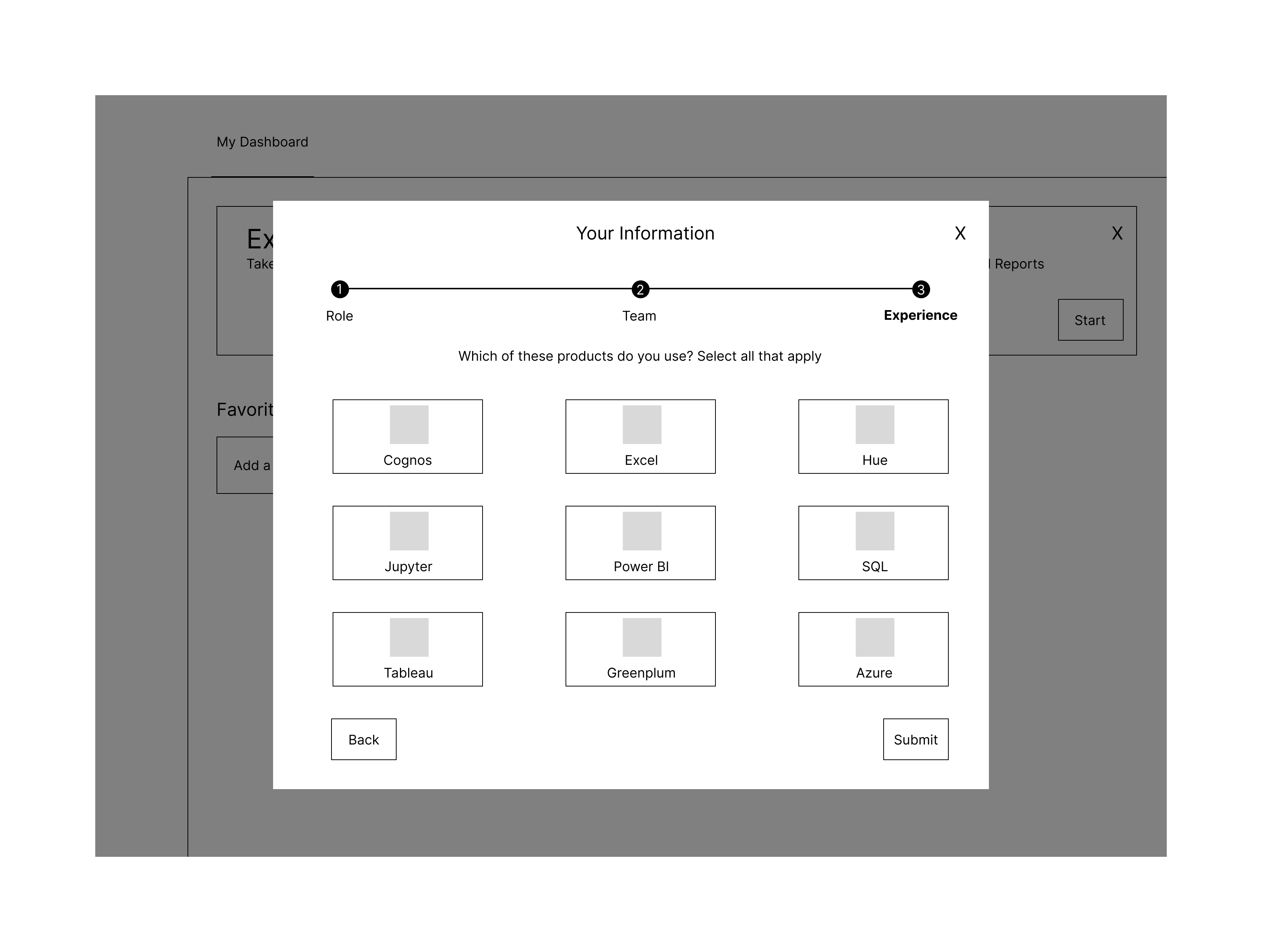
We had a lot of users who only used one feature of the tool, so I wanted to design a walkthrough feature that activates on the homepage to allow them to learn about all the tools available.
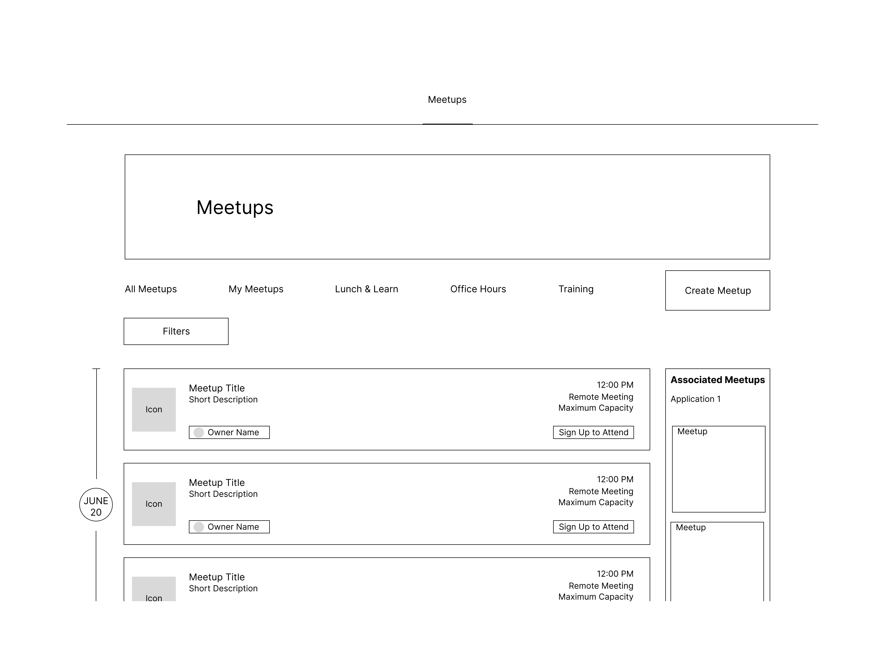
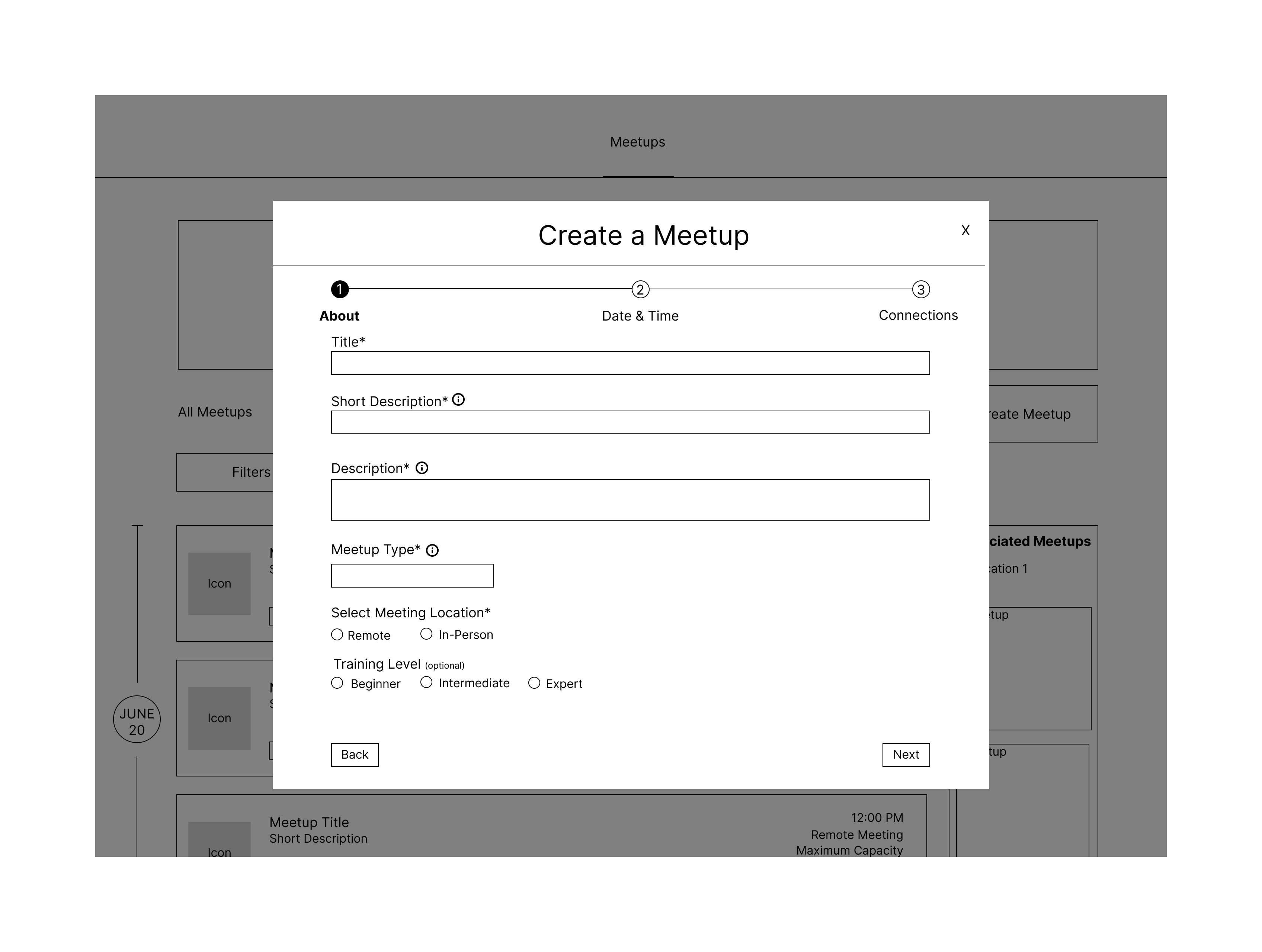
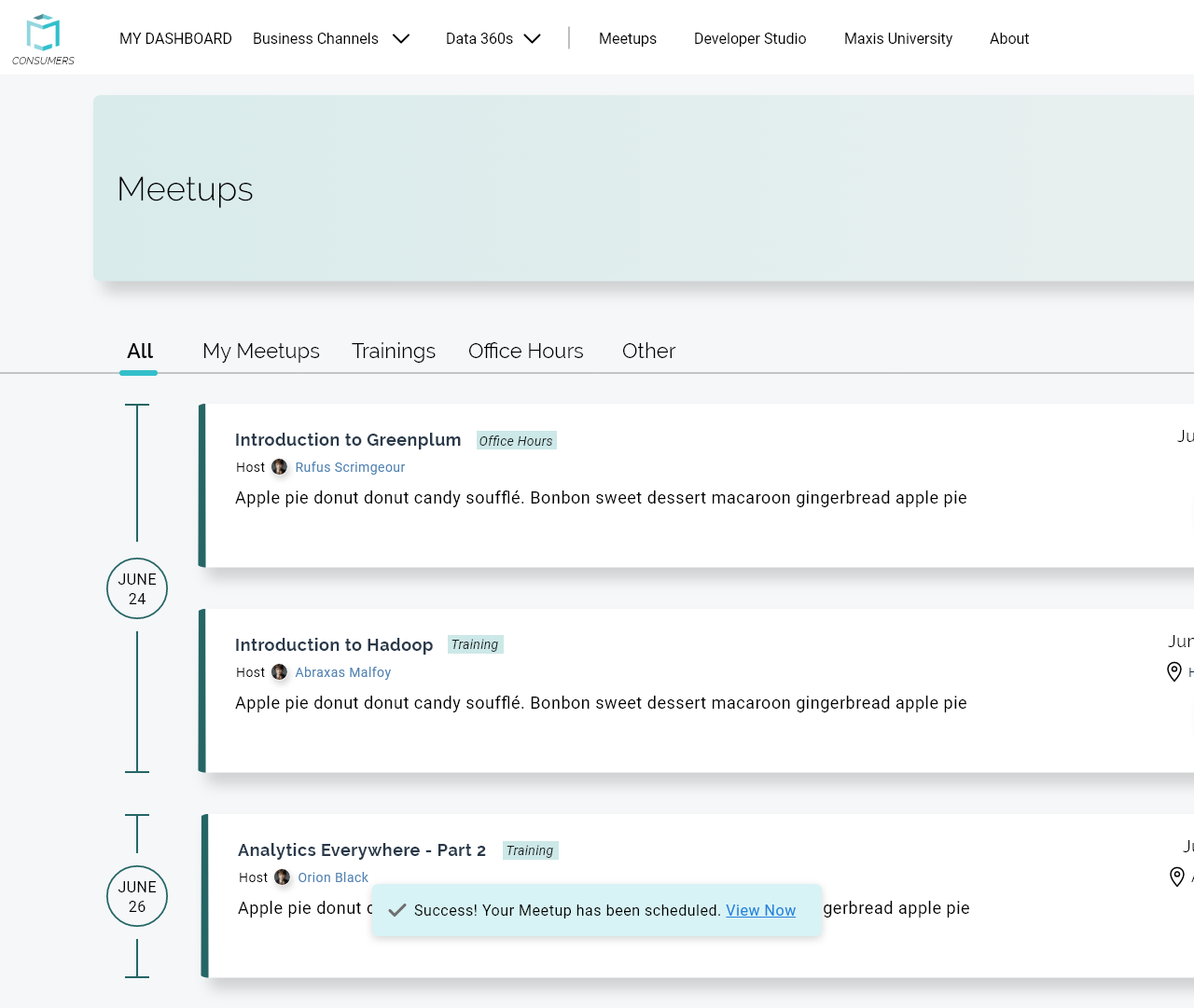
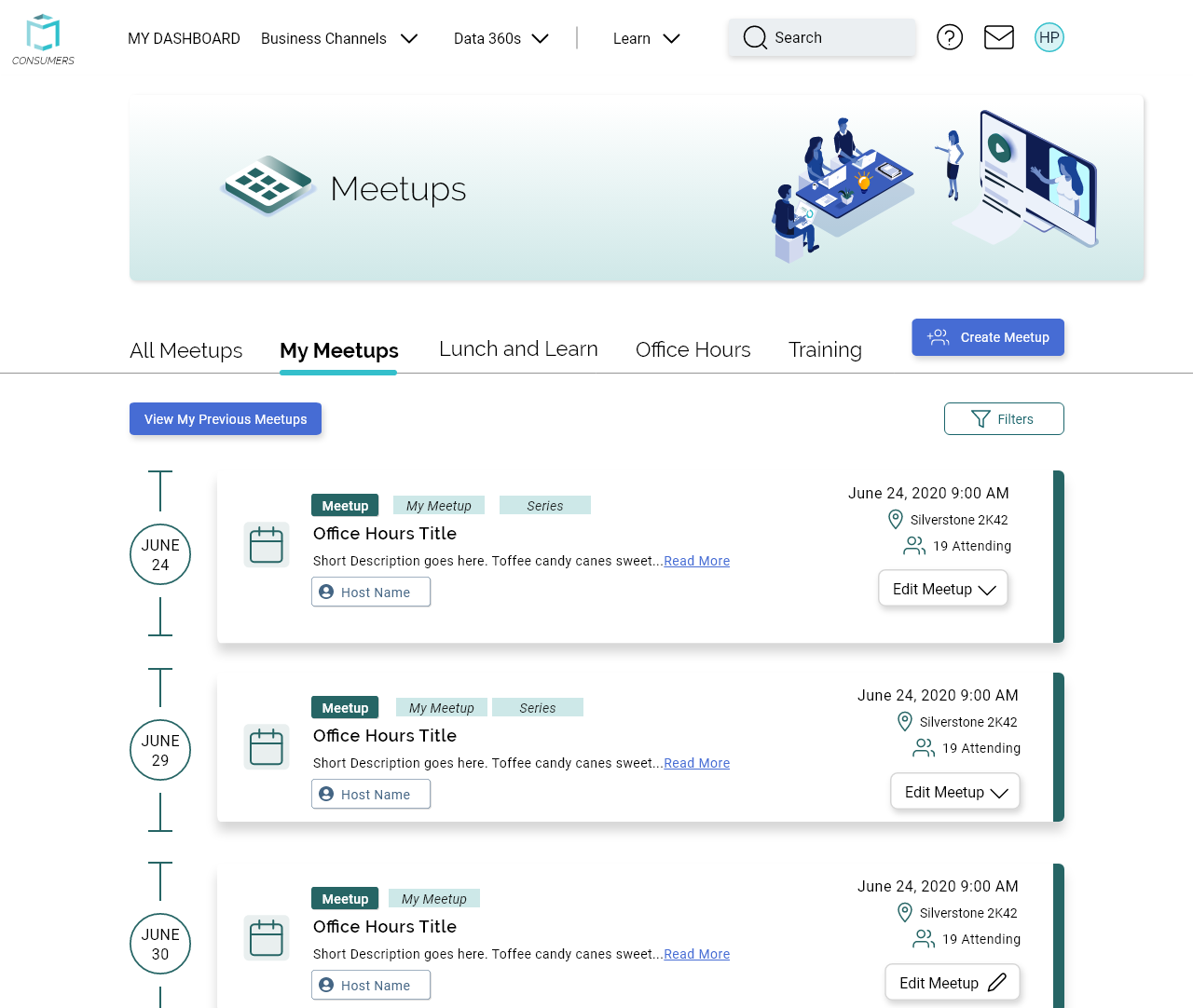
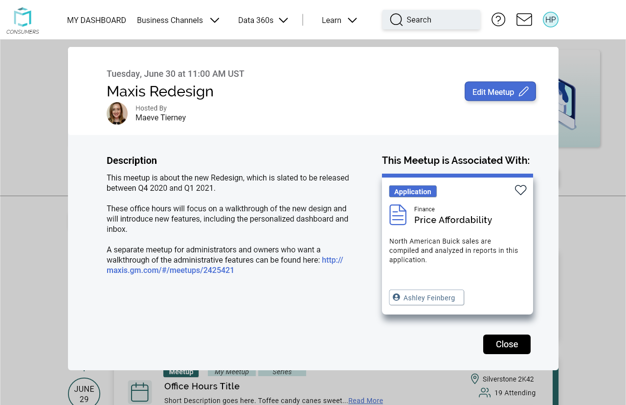
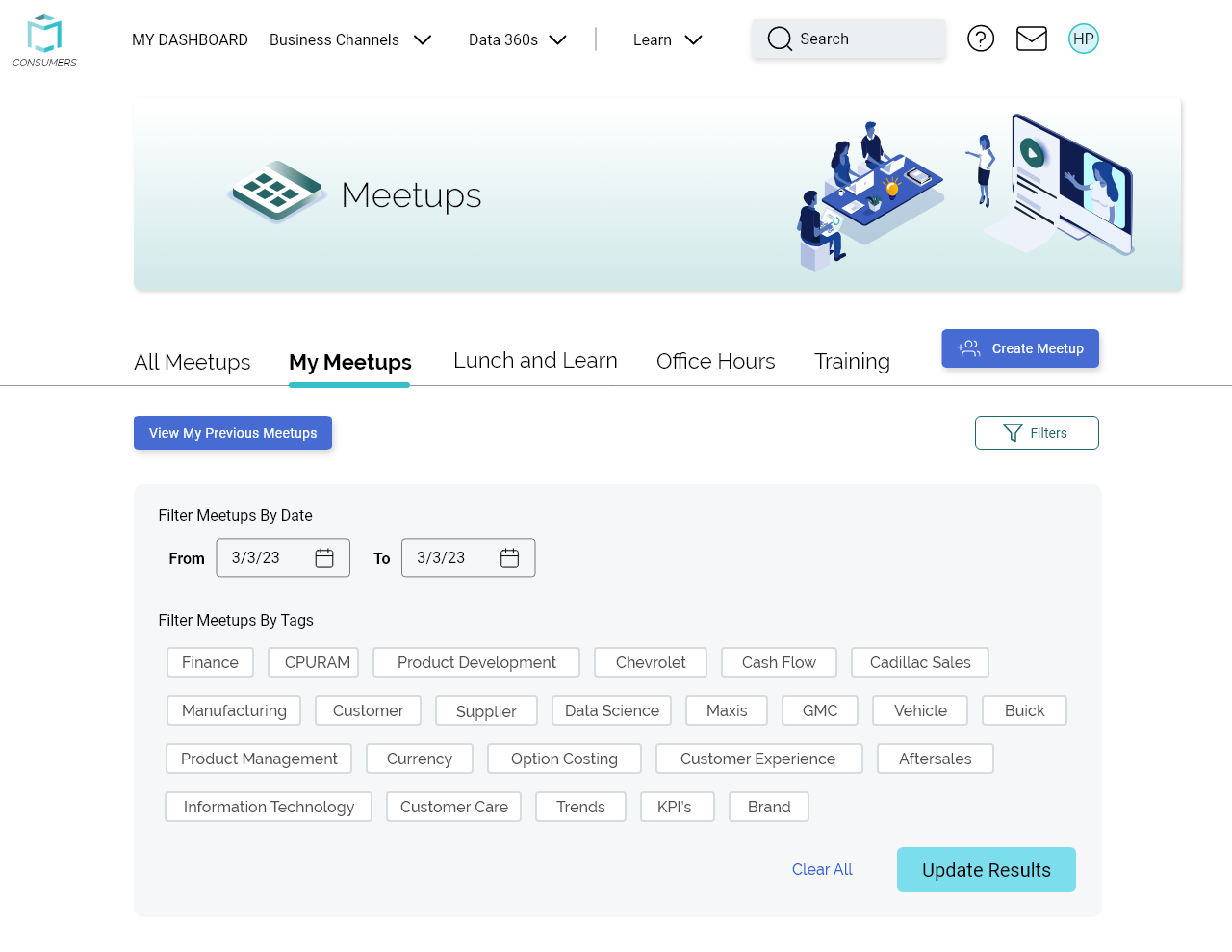
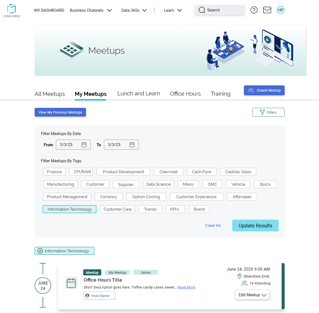
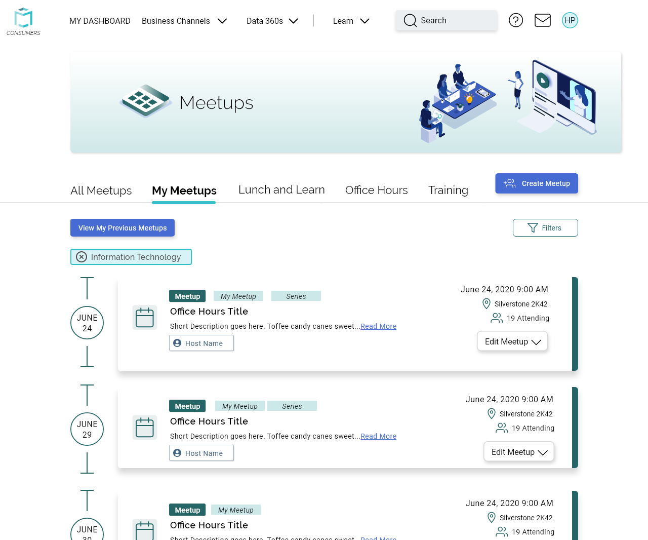
Another Consumers feature we had was Meetups. Meetups are user-created events that anyone could sign up for, such as Power BI trainings. During the usability tests, many users felt overwhelmed by the information on the tiles, so I tried to prioritize and reduce information displayed on event tiles. The filters also took up a lot of space since all the possible options showed up at once.
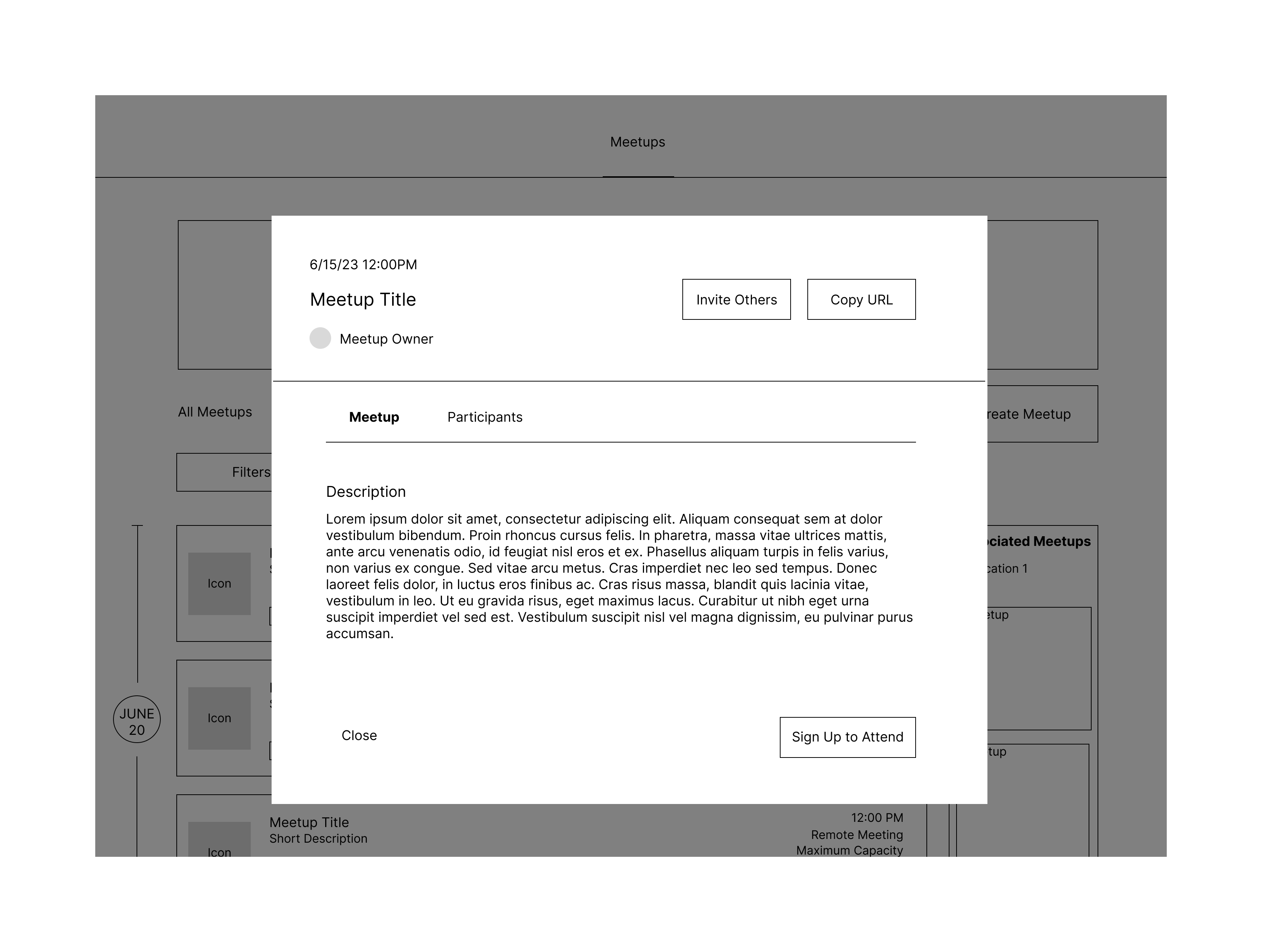
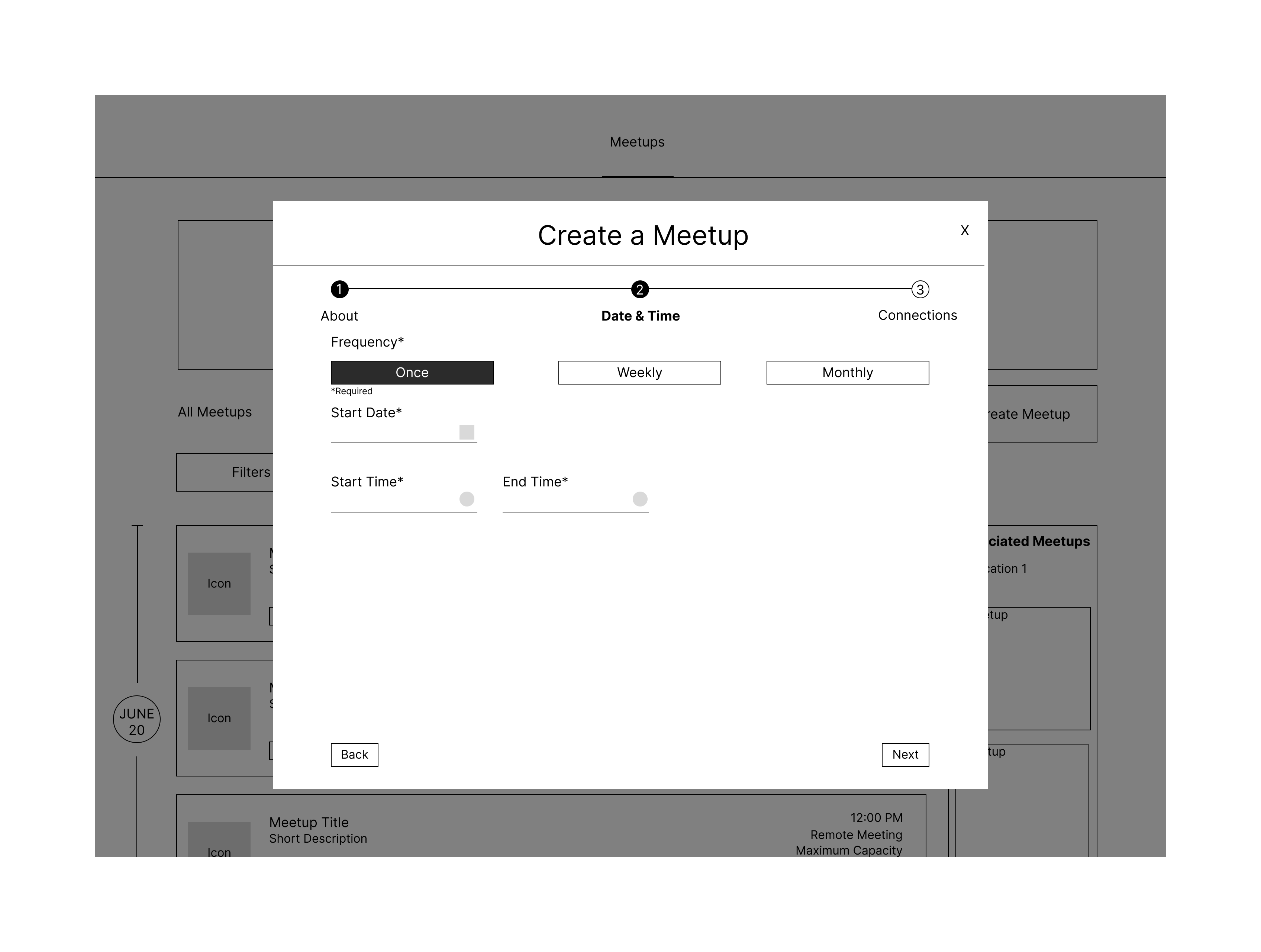
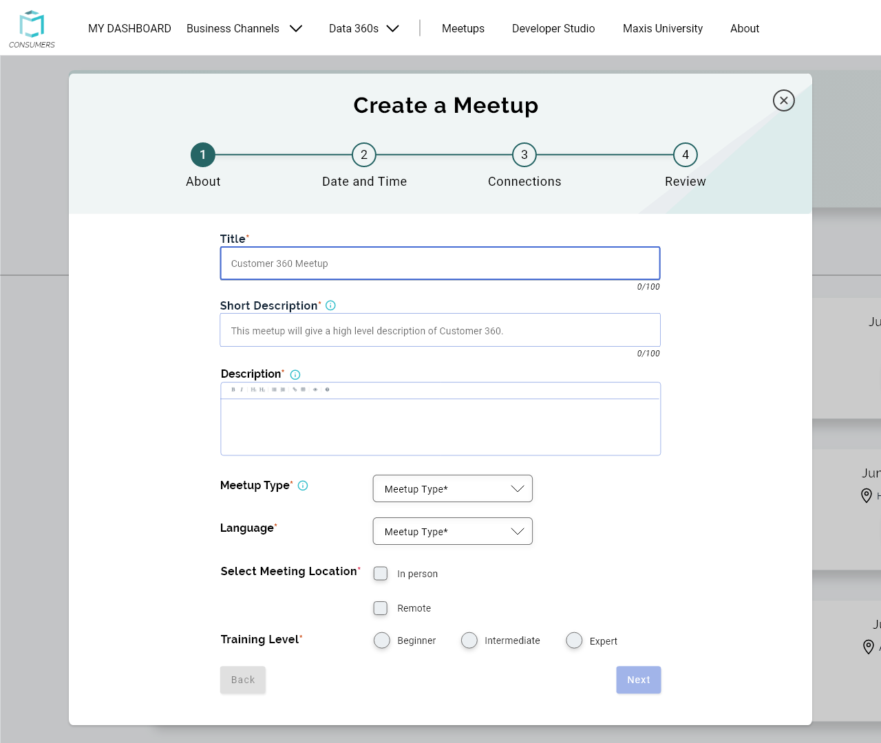
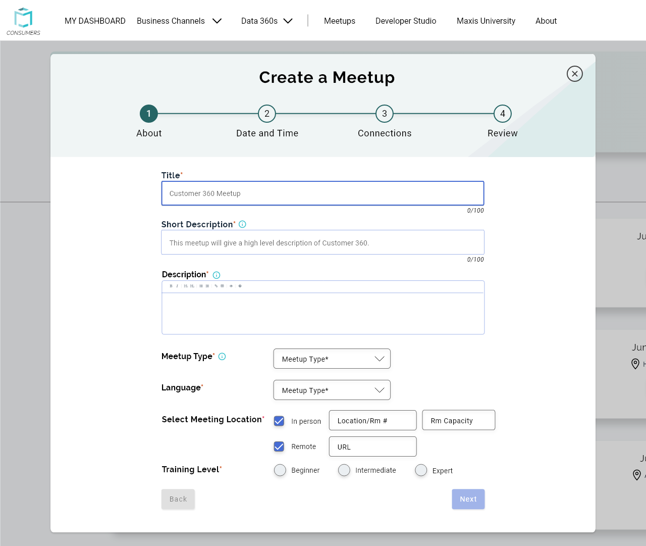
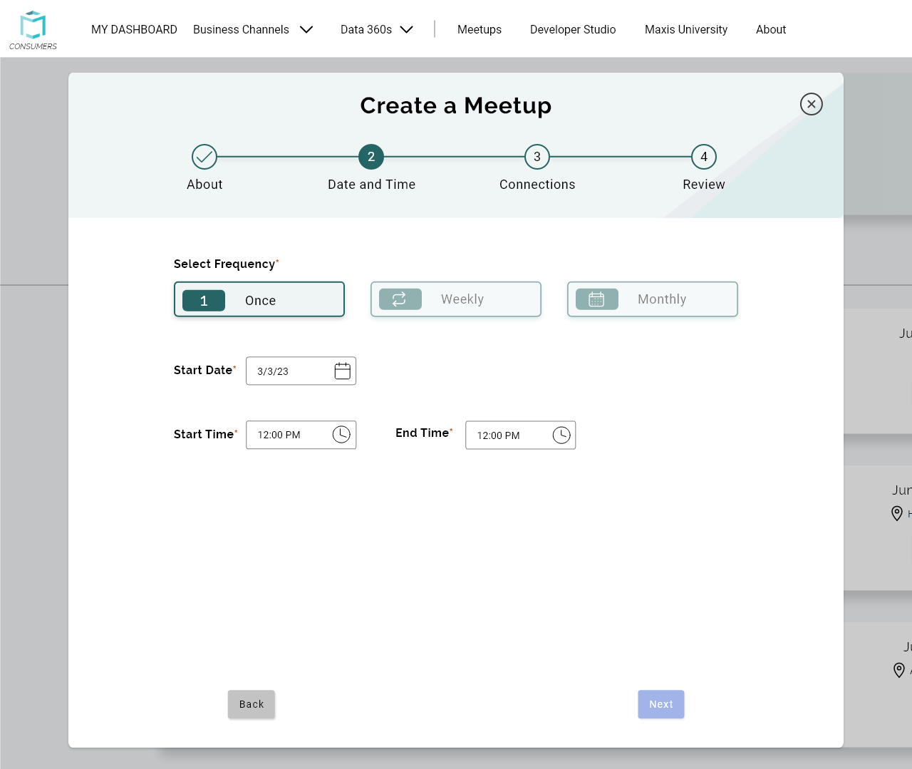
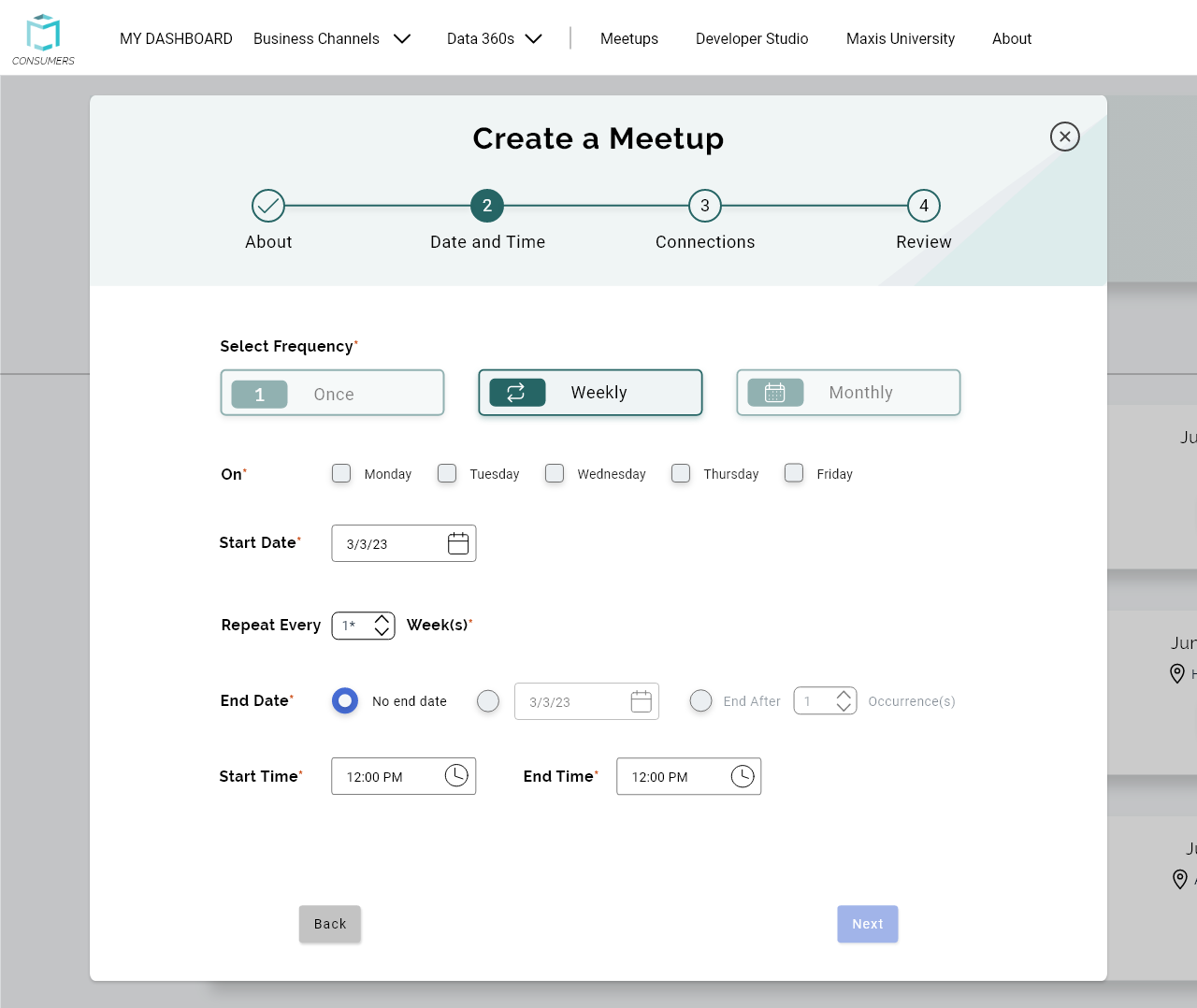
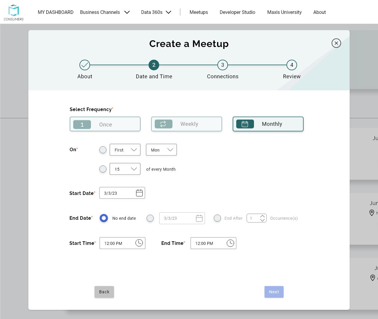
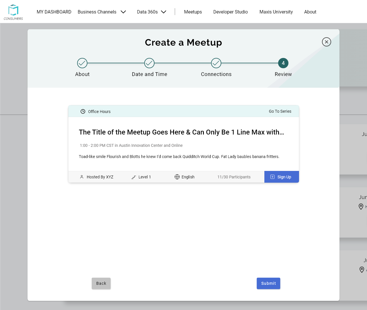
For the Meetup Creation form, there was a lot of confusion surrounding the purpose of some inputs, as well as errors when entering dates. I wanted to provide more information and organize inputs so they wouldn’t cause errors.
We then conducted a dot voting exercise with our Team Manager and Project Manager so they could decide on the options they liked the most. When the voting was complete, the other designers and I began working on the final high-fidelity designs.
Final Designs
We did not have a deadline for the final designs, but we decided to split up the work by having each person work on their own features to be more efficient and get the changes pushed to the live site more quickly. I worked on the final designs for the Meetups creation form, along with a feature to organize favorite reports into groups on the homepage. We worked in Adobe XD for these high-fidelity designs.
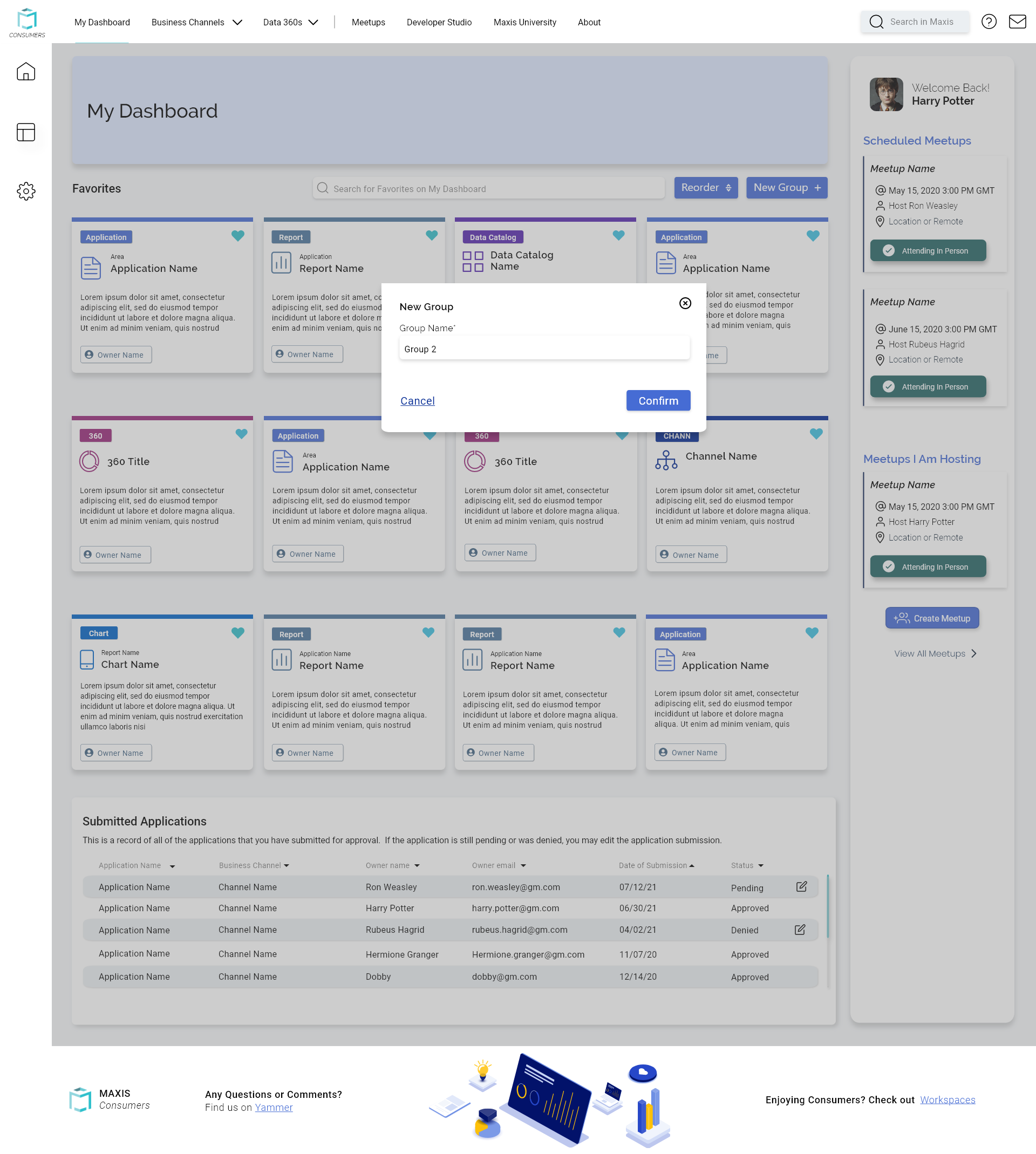
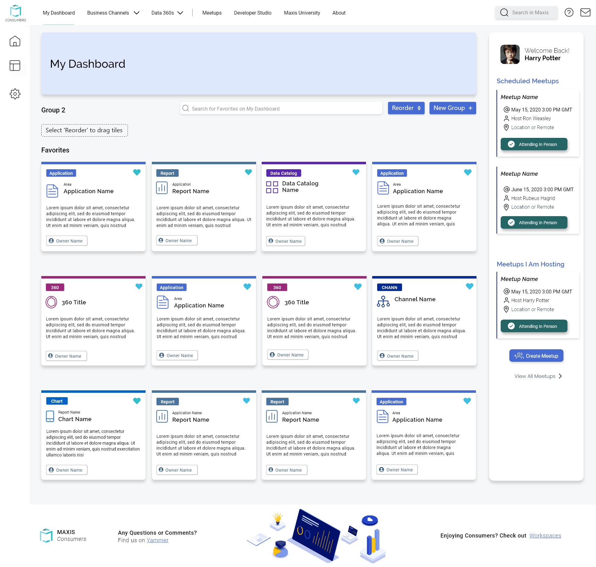
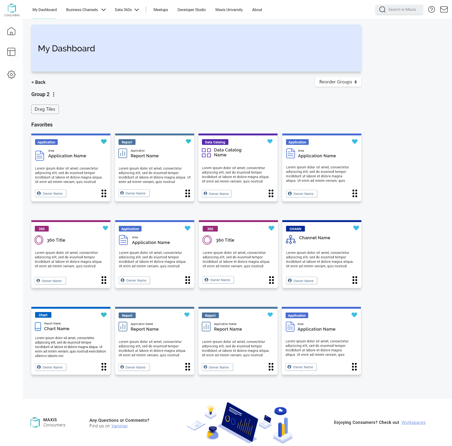
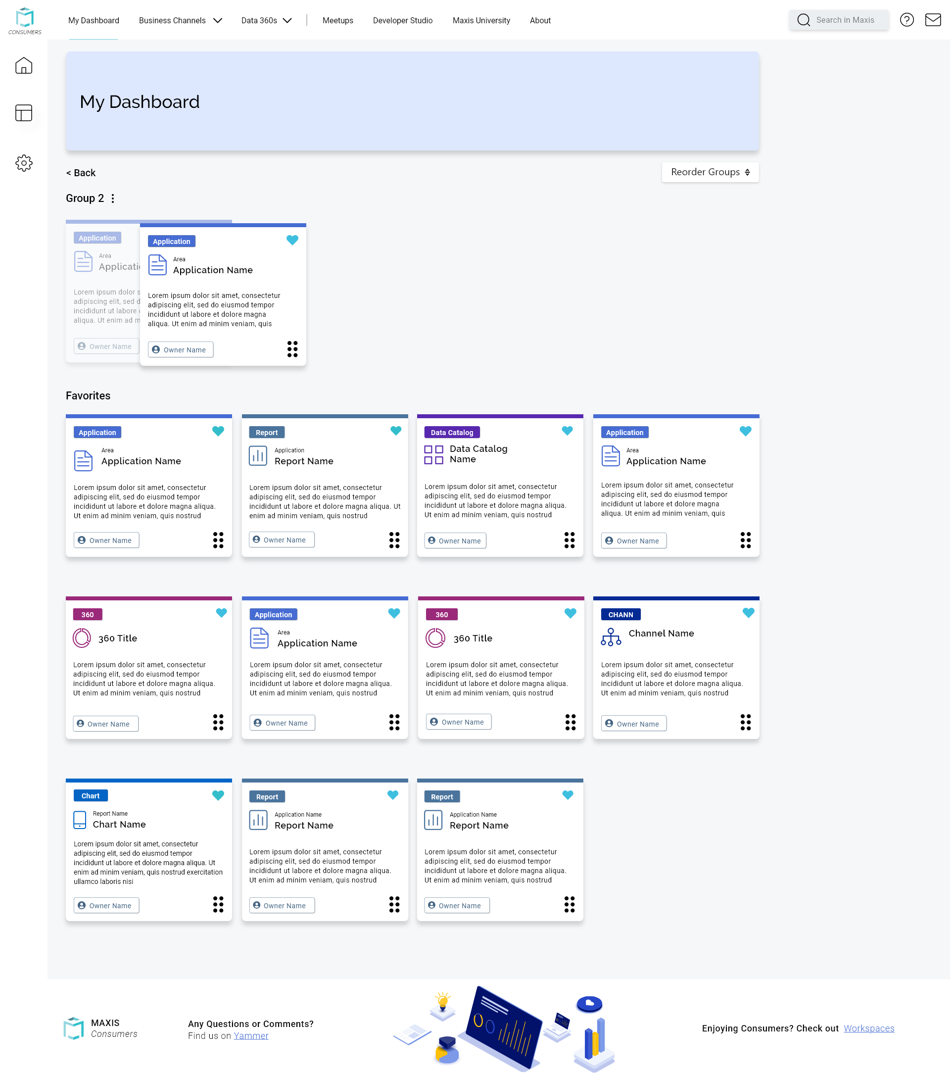
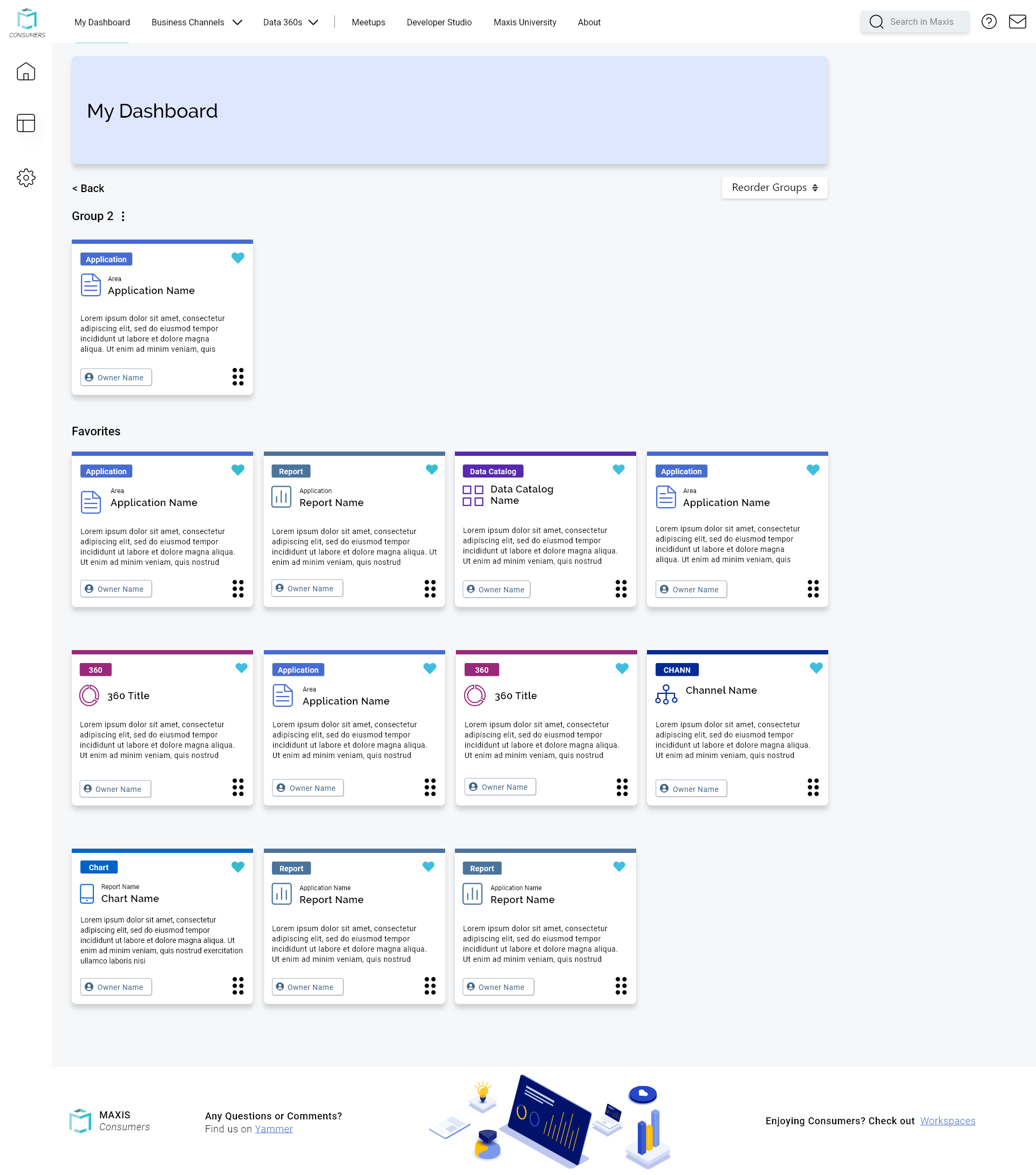
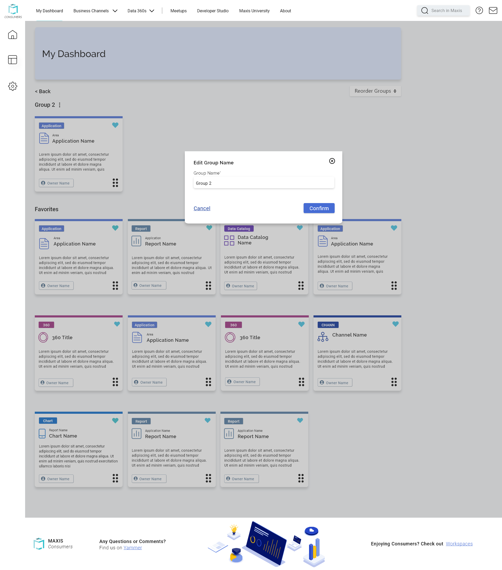
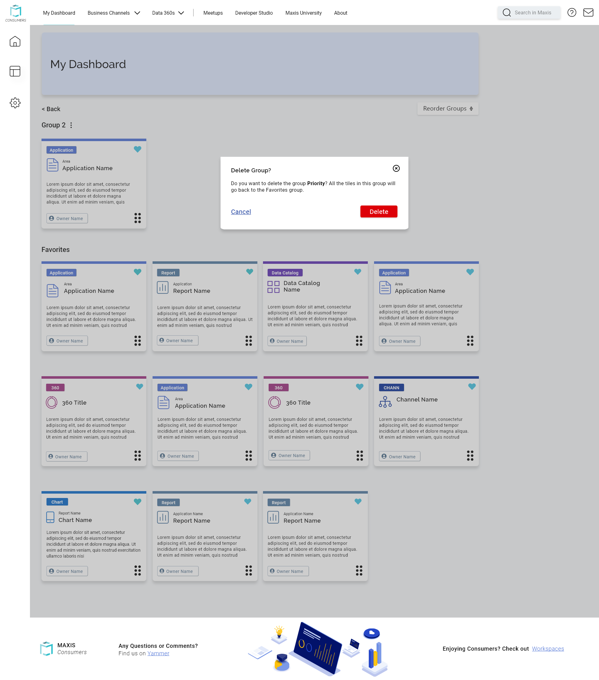
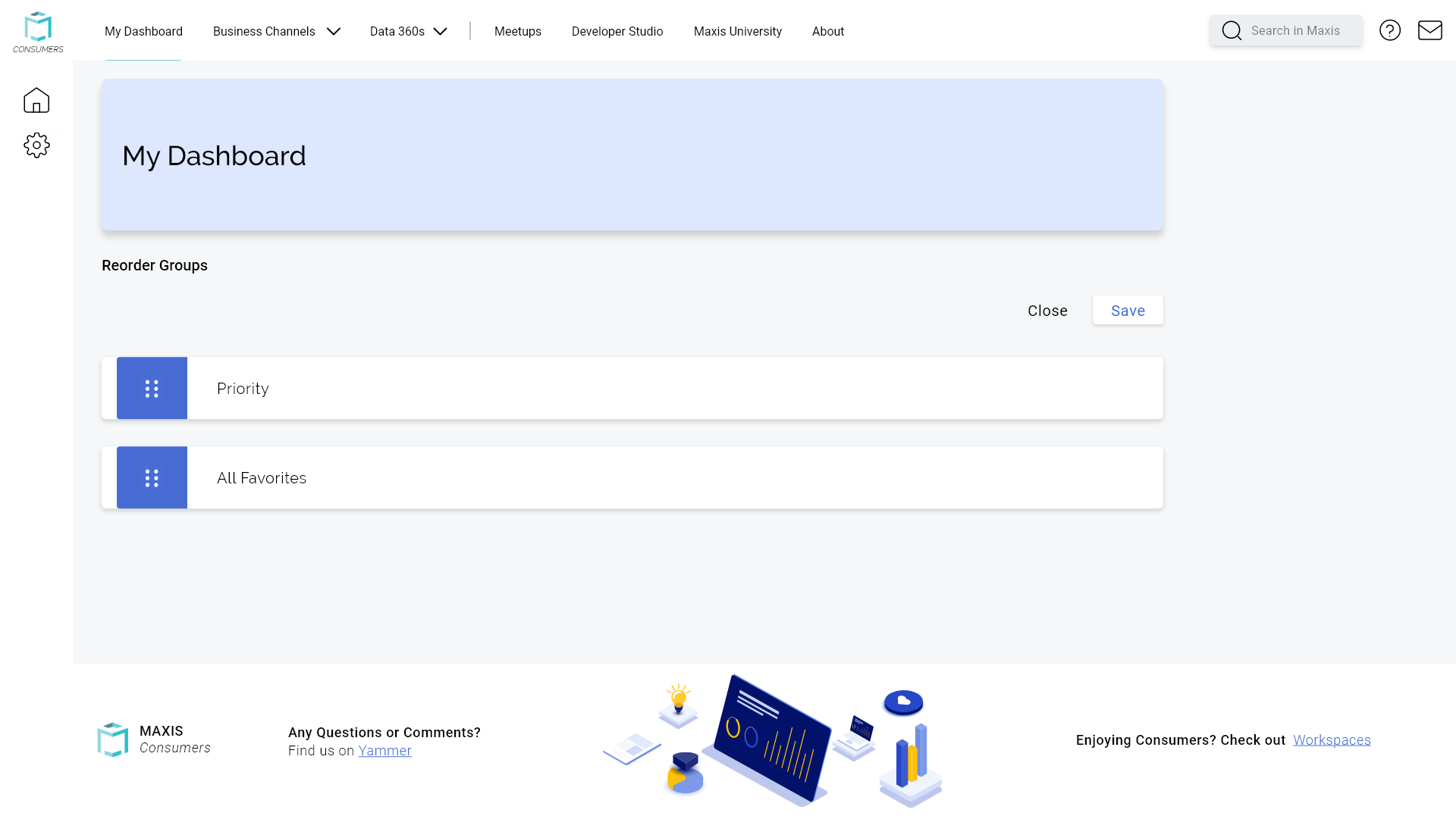
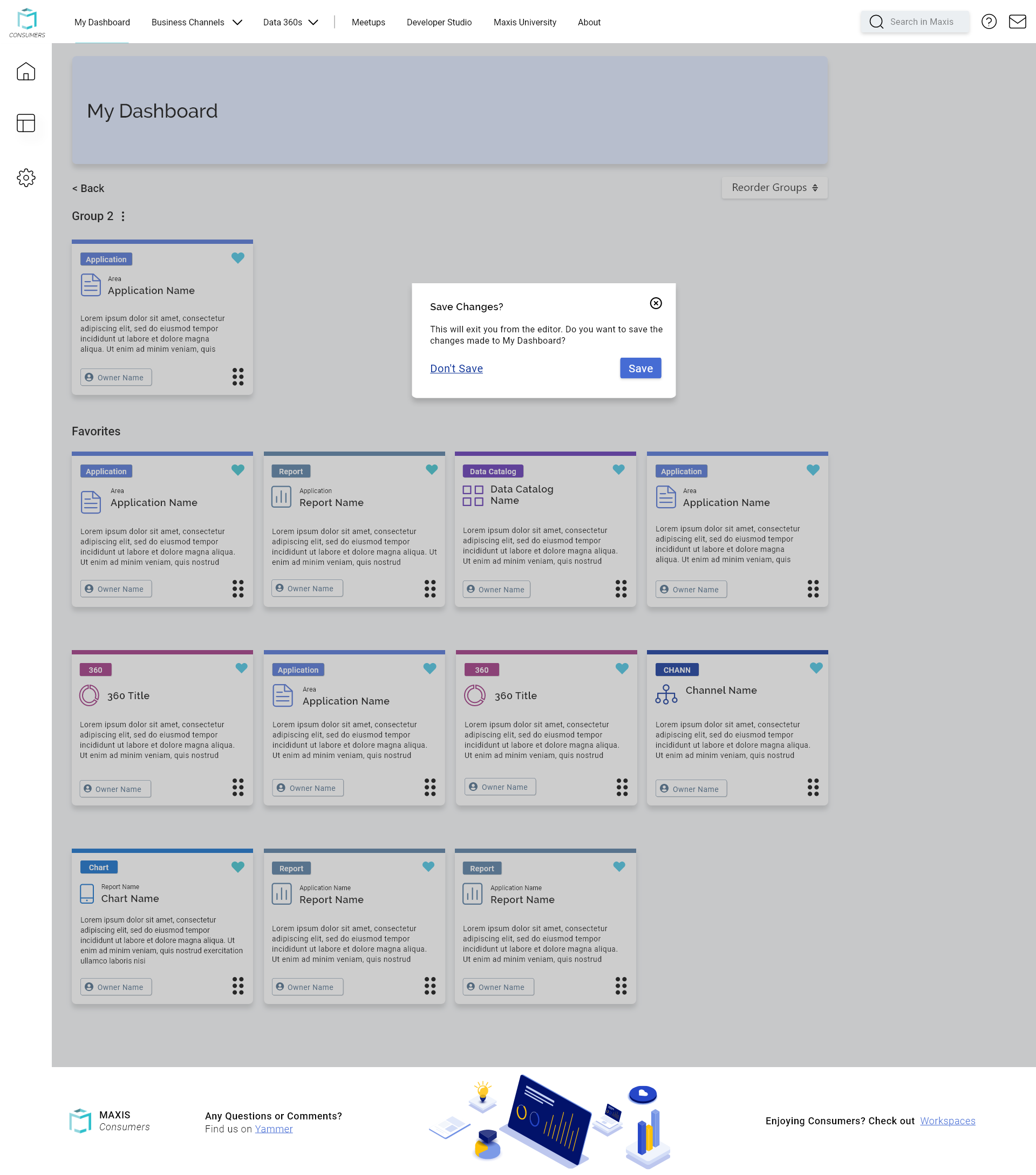
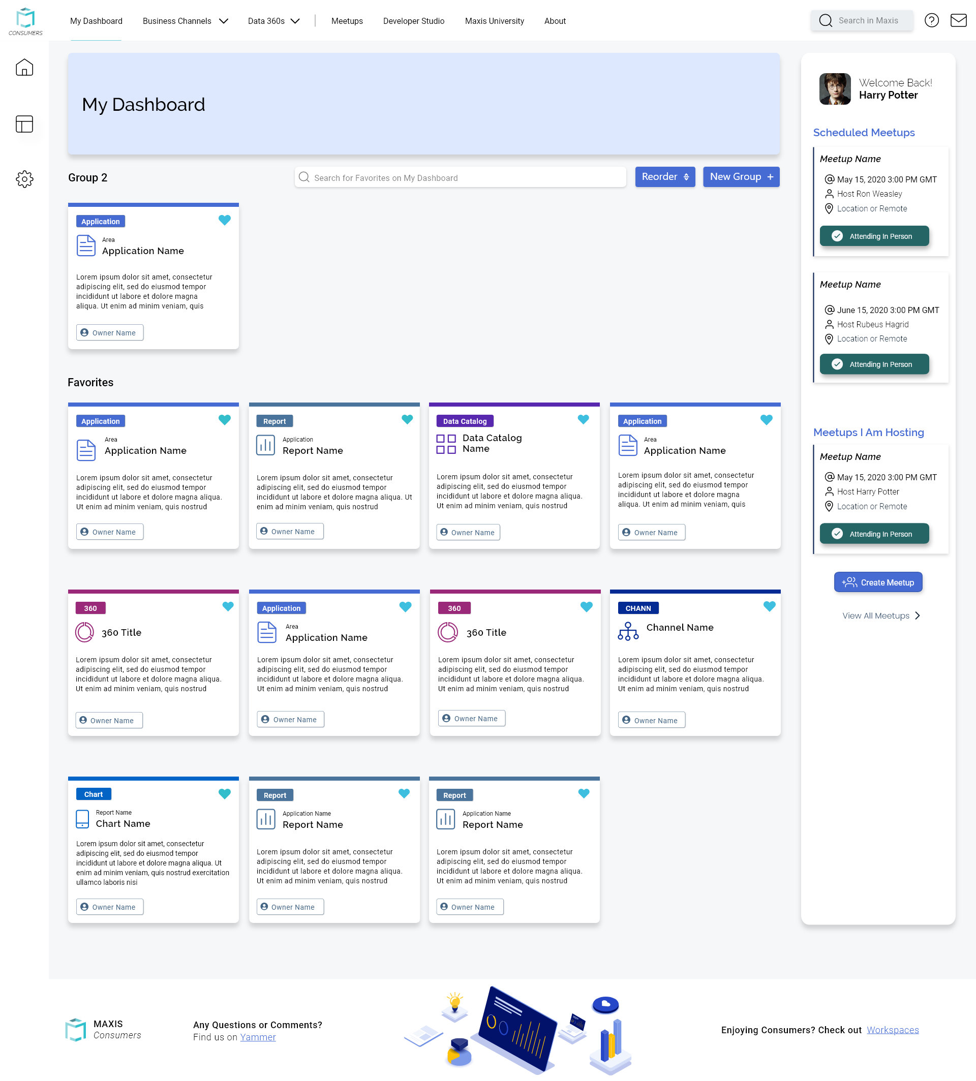
The purpose of the Homepage Favorite Groups - Reorder feature was to help users sort and keep their favorites organized since they sometimes had to access a lot of reports. Previously, there was no way for users to even change the order of the tiles. For this feature, I wanted to make sure the button for creating and adding new groups was noticeable, so I added it right above the favorited tiles. I also wanted to make sure I followed the designs we had for other pages where we add new groups, such as applications and sections to pages, to keep the designs feeling consistent. For the tiles, I added a drag icon to the bottom right. This was to follow typical design patterns from other products to signify that something can be moved. I also added a hover letting them know they can grab and drag the tile. I worked closely with the devs too, to confirm the feasibility of the order of screens and make sure the user’s information could be saved at certain steps.
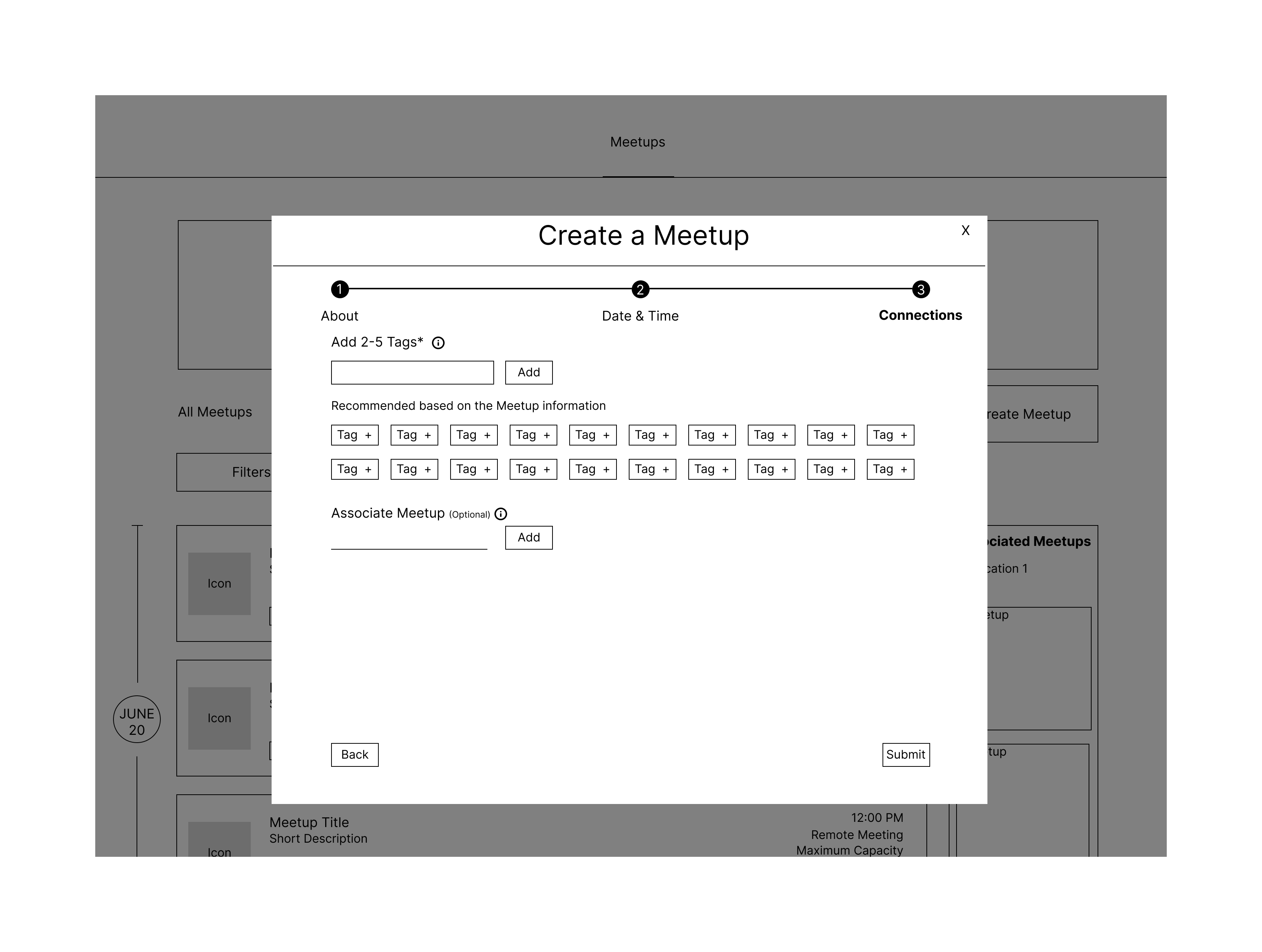
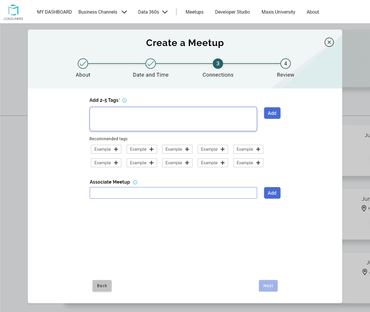
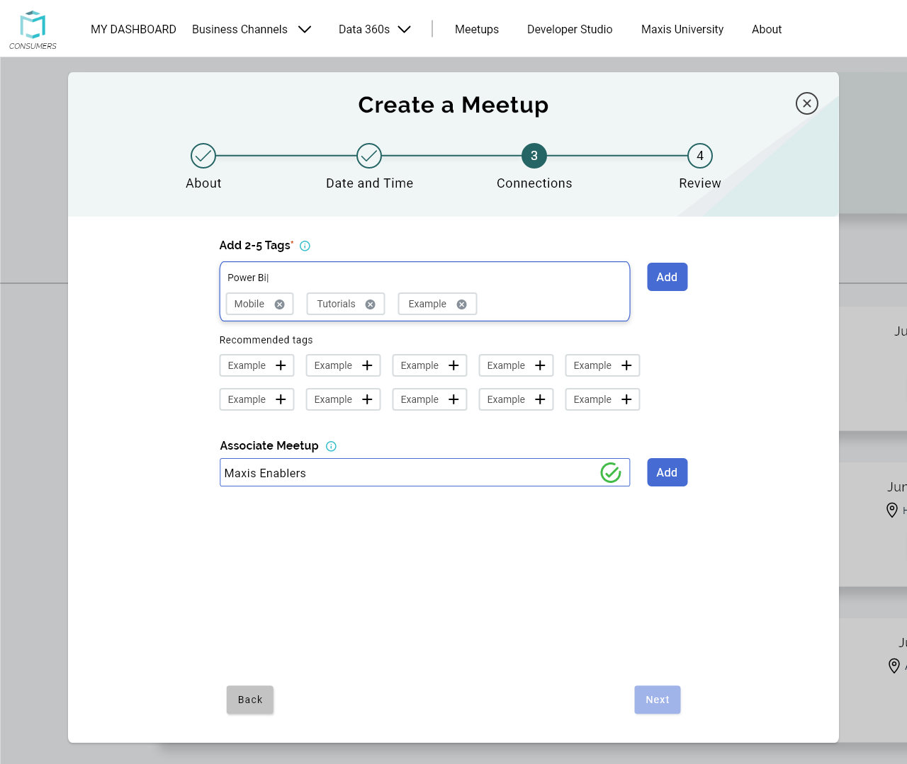
For the Meetups creation form, the main issue users had was with the error messages like when entering or selecting a start date. I worked with one of the devs to see what type of form inputs, like with React, would cause the least amount of errors. I also added some more instructions with informational i’s since some users weren’t sure about some inputs. With the tags input, users thought they needed a comma separated list, so I provided clarity on that right above the input.
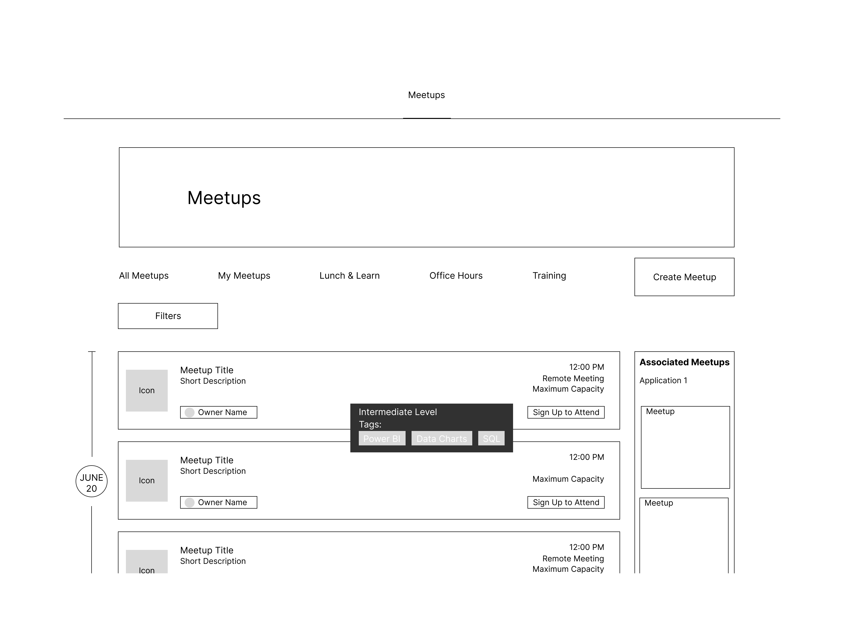
During this time and our usability tests, the website was also having some issues with responsiveness. I redesigned some elements on the Meetups page for the tiles to be displayed without cutting information off. To alleviate some of these issues, I added buttons for info to be expanded. I also changed the positions of some elements, like the tags which were on the right but would get cutoff on a small screen.
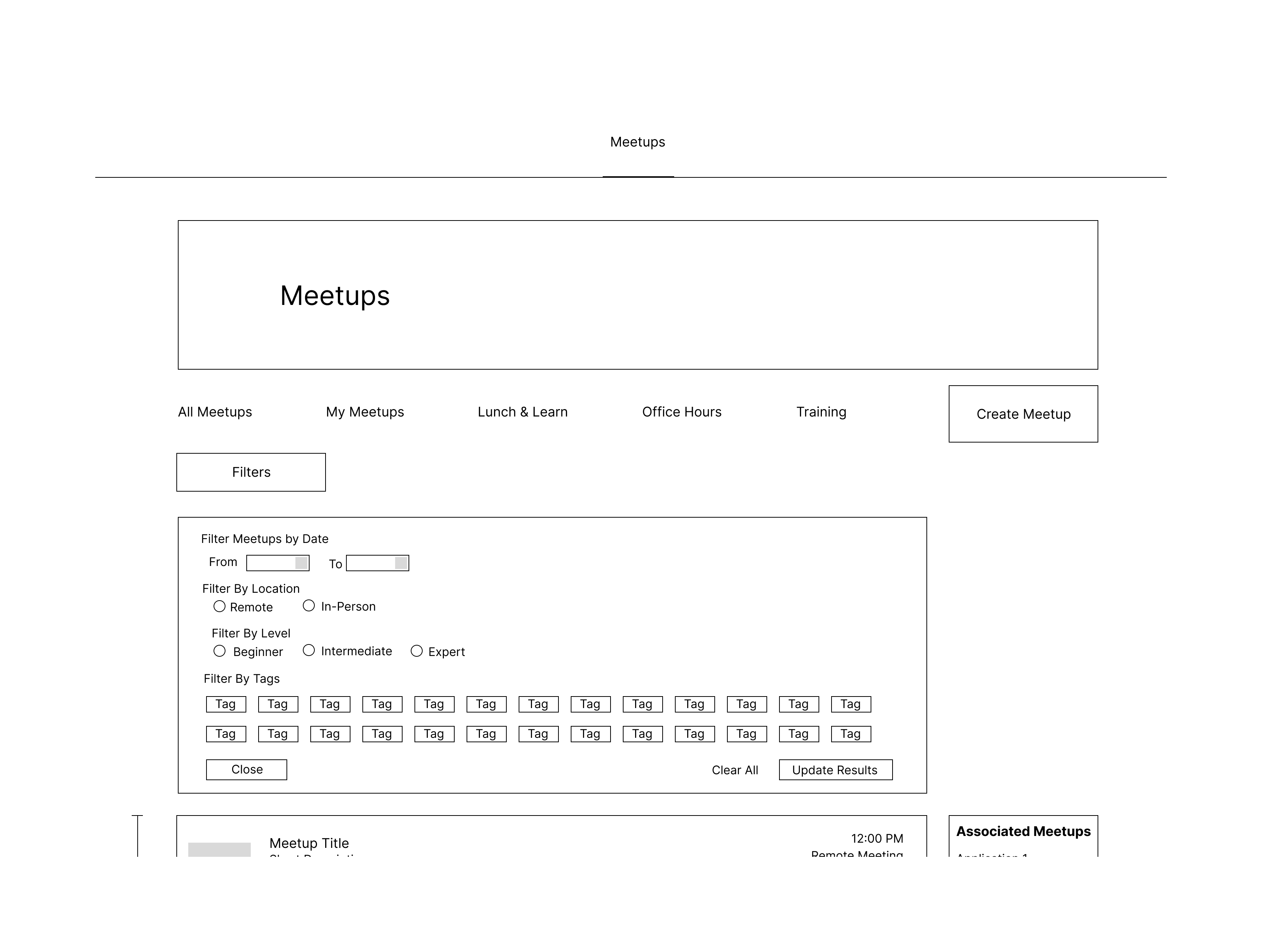
Another feature users wanted was a more organized way to display and select filters for the Meetups page. I created a button for Filters that opened a container right below the search bar. I wanted to add clarity for when exactly filters would be applied, so I added an Update and Cancel button. This would make the application of filters more intentional for the users as well. Once filters were applied, the container would close but a chip for each filter would be visible. Users can also select the X on the chip to get rid of them, so they don’t have to click through the filter window again.
After creating the designs, I made the functional prototypes including hover and select states. I then handed them to the developers.
Conclusion
I designed to the best of my abilities and made sure I accounted for all changes and use cases, but I asked for feedback from my teammates when possible, including the other designers and my managers. This ensured the designs met our business needs and user needs. I had to really consider feasibility with the developers in mind, but I think those considerations also improved my designs. The changes to Meetups led to a 20% increase in the number of meetups. After the release with the changes from the redesign, we also gained 2000 users, going from about 20,000 users to 22,000.
I was very satisfied with the design process we took, as I felt we were able to fully account for the feedback from our usability tests. This was also my first time on this team working mostly independently on a feature. I enjoy collaborating with other designers but I also liked working on a feature myself. I believe doing this helped us push the designs faster, even if we didn’t have a deadline.
- UX Design
- UX Research
- Prototyping
- Adobe XD
- FigJam