Assignable Ebook - Multiple Choice
Design process for the multiple choice question frame
Though it is important to have great usability in every industry, Education is one of the most important industries as more educational tools are developed in technology and students of all abilities are required to use them. Because of this W. W. Norton has been updating their ebook reader for more accessible use. Along with updating the look of the ebook, they have been adding new features for professors to assign additional content to their students, including interactive content like multiple choice questions. These assignments are consistent for each book, e.g. a biology book will have the same assignments for every different school and class that uses it, and the assignments for one chapter can be graded on most Learning Management Systems.
From February to May, I got to work with the Design team at W. W. Norton on the designs for the multiple choice frames for the Assignable Ebook. During those three months, we focused largely on the design of the multiple choice questions.
Research
Requirements
The requirements were defined by our stakeholders and product owners. We were given a list of user stories whose criteria we had to meet. We also made sure all our ideas were feasible for our dev team and the product they have built out so far. As we learned more about the feasibility, we revisited the stories to provide additional acceptance criteria by introducing user stories from an accessibility perspective. From previous research, we knew that we would need to design for users with screen magnifiers. With guidance from our UX copywriter and our Accessibility Expert, we made sure the language and accessibility of the product would be prioritized starting from the very beginning of our design process.
Students would need to answer multiple choice questions as part of a chapter assigned to them through their Learning Management System. Depending on the chapter, some would include more than one multiple choice question, or Interactive activity as well, such as watching a video or reading a certain passage. These were some of the considerations needed when thinking of our designs.
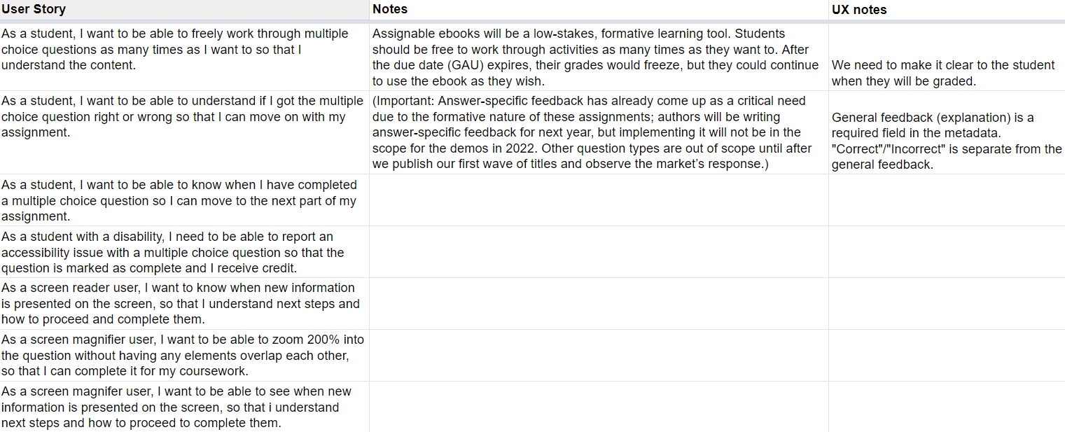
Figure 1. - Some of the user stories given by the stakeholders.
Competitor Analysis
To see how other learning tools use multiple-choice questions, I conducted a competitive analysis with websites like Canvas, Duolingo, and Pluralsight. I tried noting features like the labeling of answer options, question feedback, and acessability features like reporting issues. I focused on the different features depending on what most of the tools used, as well as focusing on features that could complete our user stories. We knew our multiple choice questions needed to be accessible and that they should allow for some type of response feedback, even if it wasn't unique for the MVP. Khan Academy had the most features compared to what we wanted.
Using some ideas from the different platforms, I went on to design low-fidelity wireframe concepts with the rest of the design team.
Design
Initial Concepts
Some of the features we wanted were labeled answer choices, displayed due date, and a report issue button. The question frame also needed to display some type of feedback inside.
My teammates had similar concepts to a combination of the formatting from the first concept and the feedback from the second. The reason why the third concept wouldn't work as well is because we had to consider images. I also learned that questions would only need either answer specific feedback or general question feedback, never both.
From our initial talk with our Accessibility expert, we also thought it would be best to avoid icons only for feedback, like I had in my second concept. I learned that if icons are used, it's always best to have a label along with it. Though a lot of icons have common use cases across different products, like a search icon, it still may not be clear to every user.
For the question feedback, the inline feedback would be an issue for accessibility because of how it appears in the focus order of a magnifier. This would also take up more screen real estate that we already had a little bit of.
With these details in mind, we iterated on our designs.
First Iteration
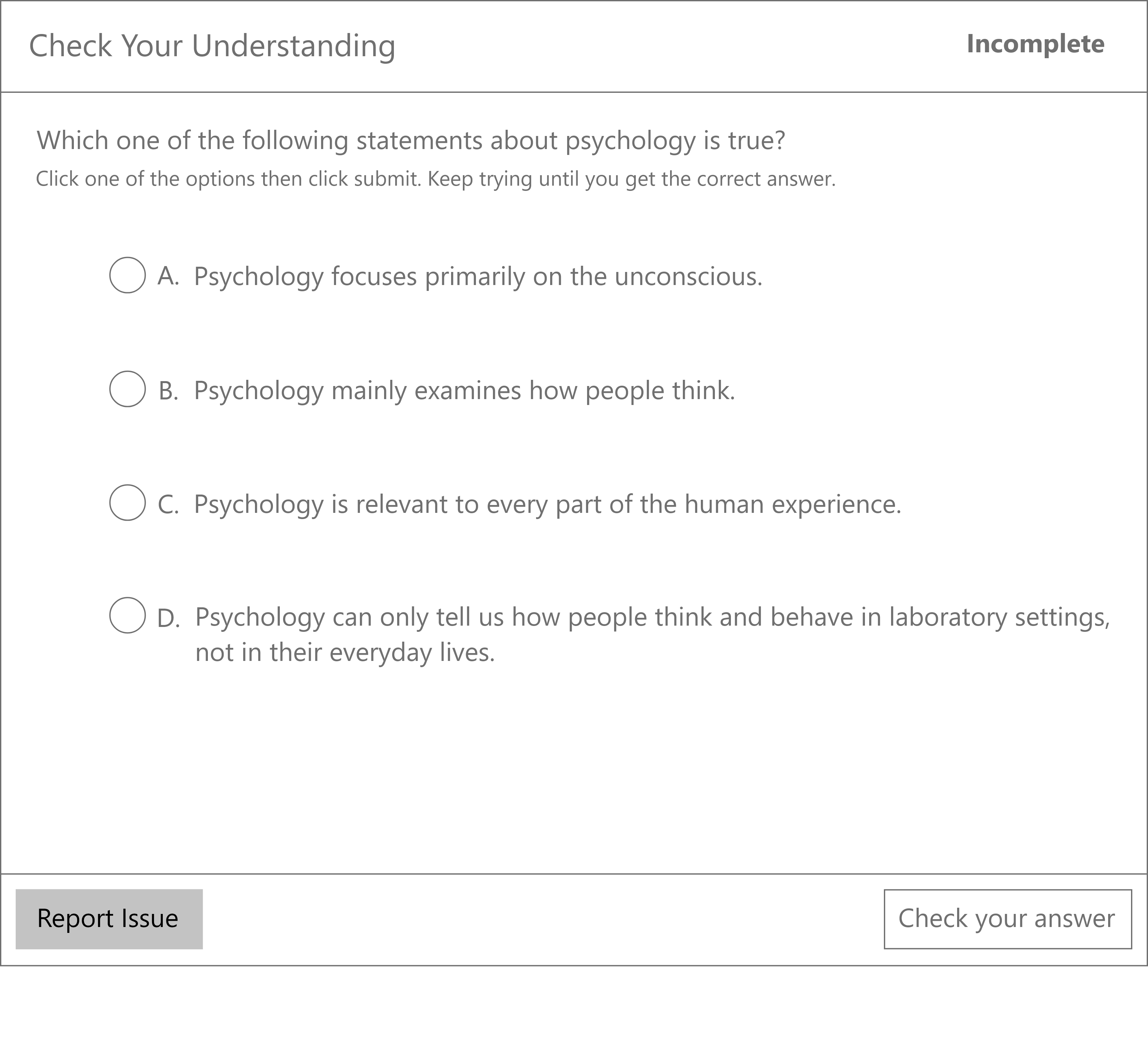
The main changes I made were aligning text to the left for consistent reading with the rest of the ebook and labelling the answer choice with an word label as opposed to icons. I also kept the feedback at the bottom, so the height of the frame wouldn't change and so users could consistently look to the same place to see their feedback. I included a completion state like my teammates did as well. Since the whole chapter would be considered an assignment, it would be better to replace the due date at the top since the due date can be shown somewhere else in the ebook.
After one final talk with our accessibility expert though, there was one better-suited approach.
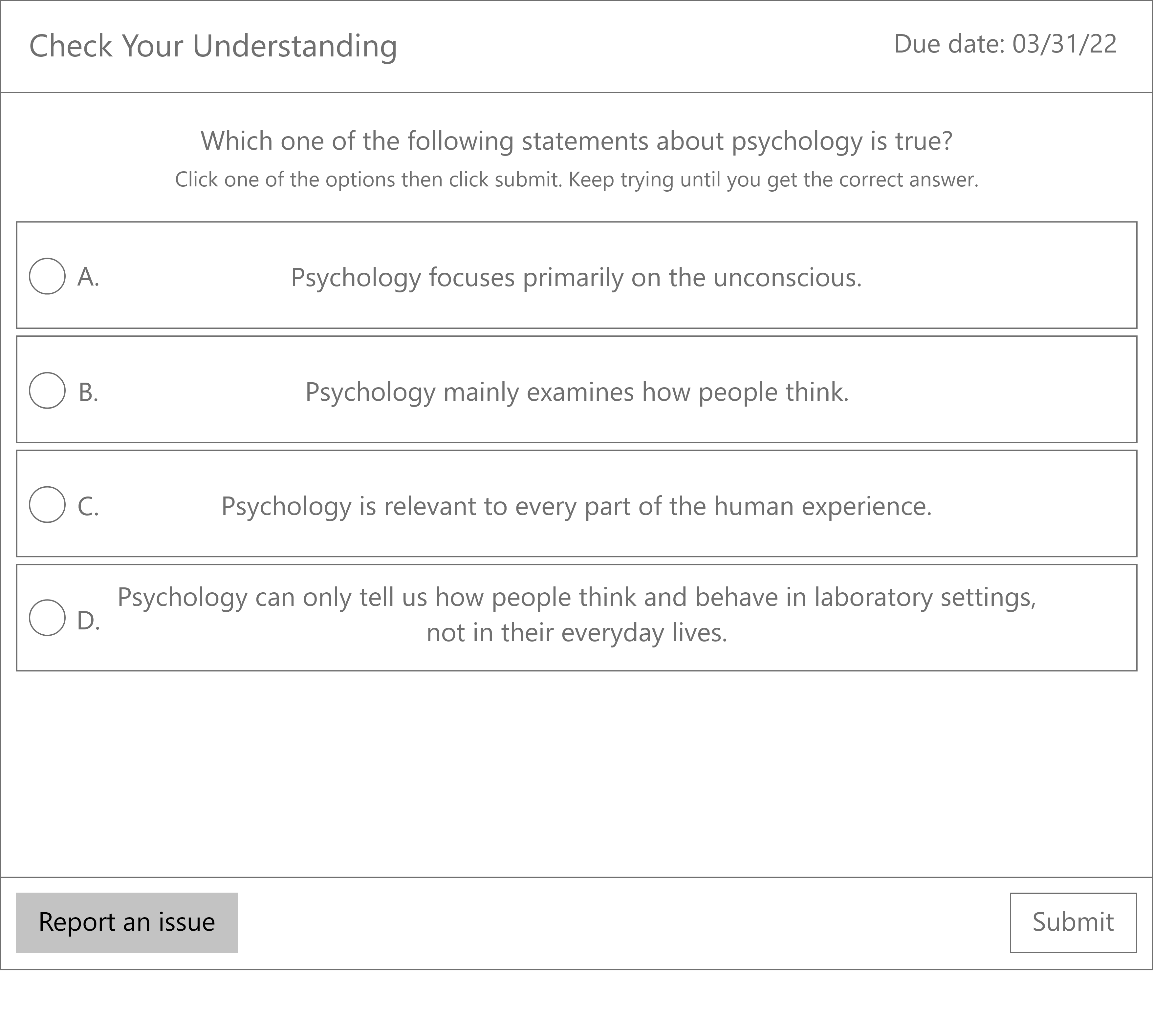
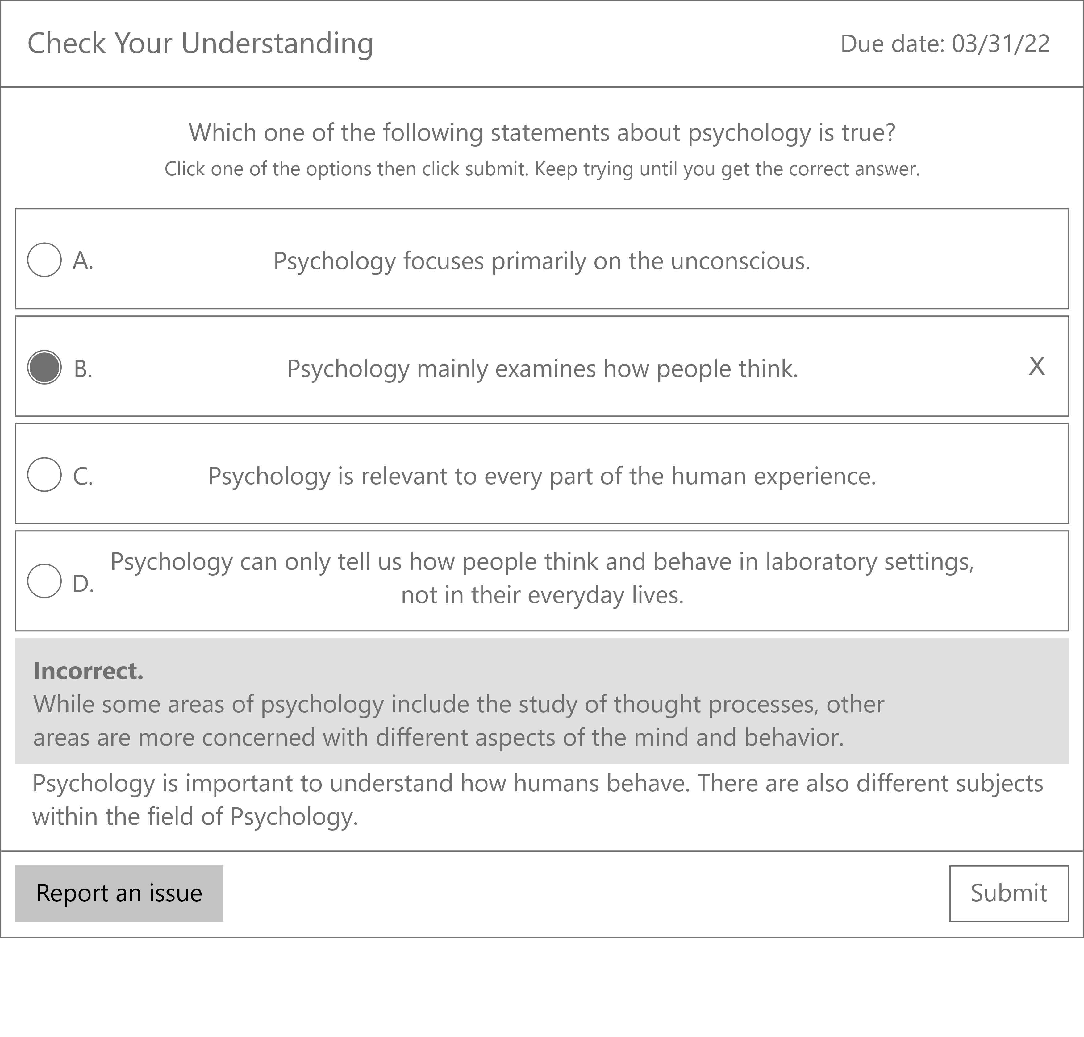
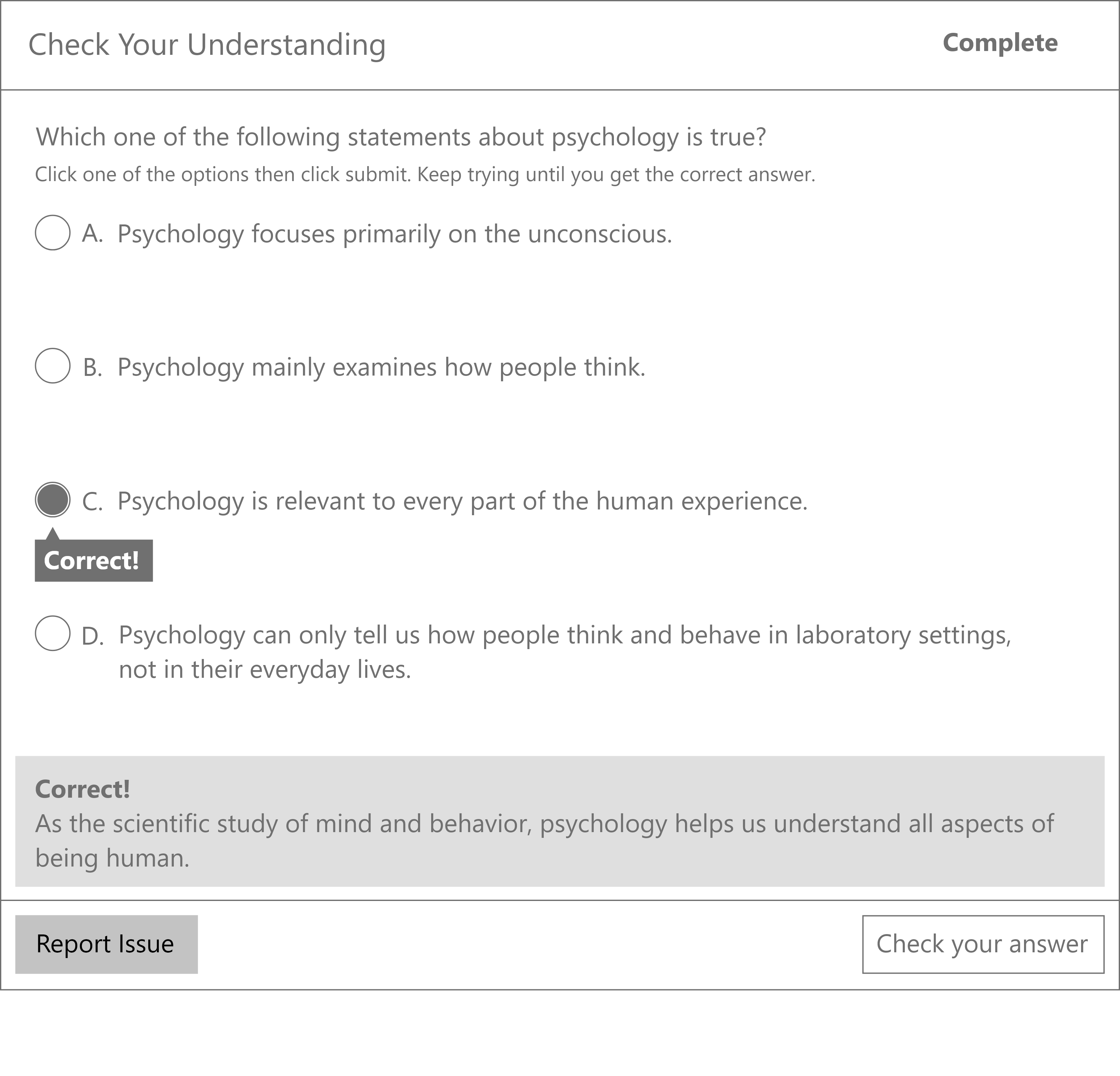
Final Design
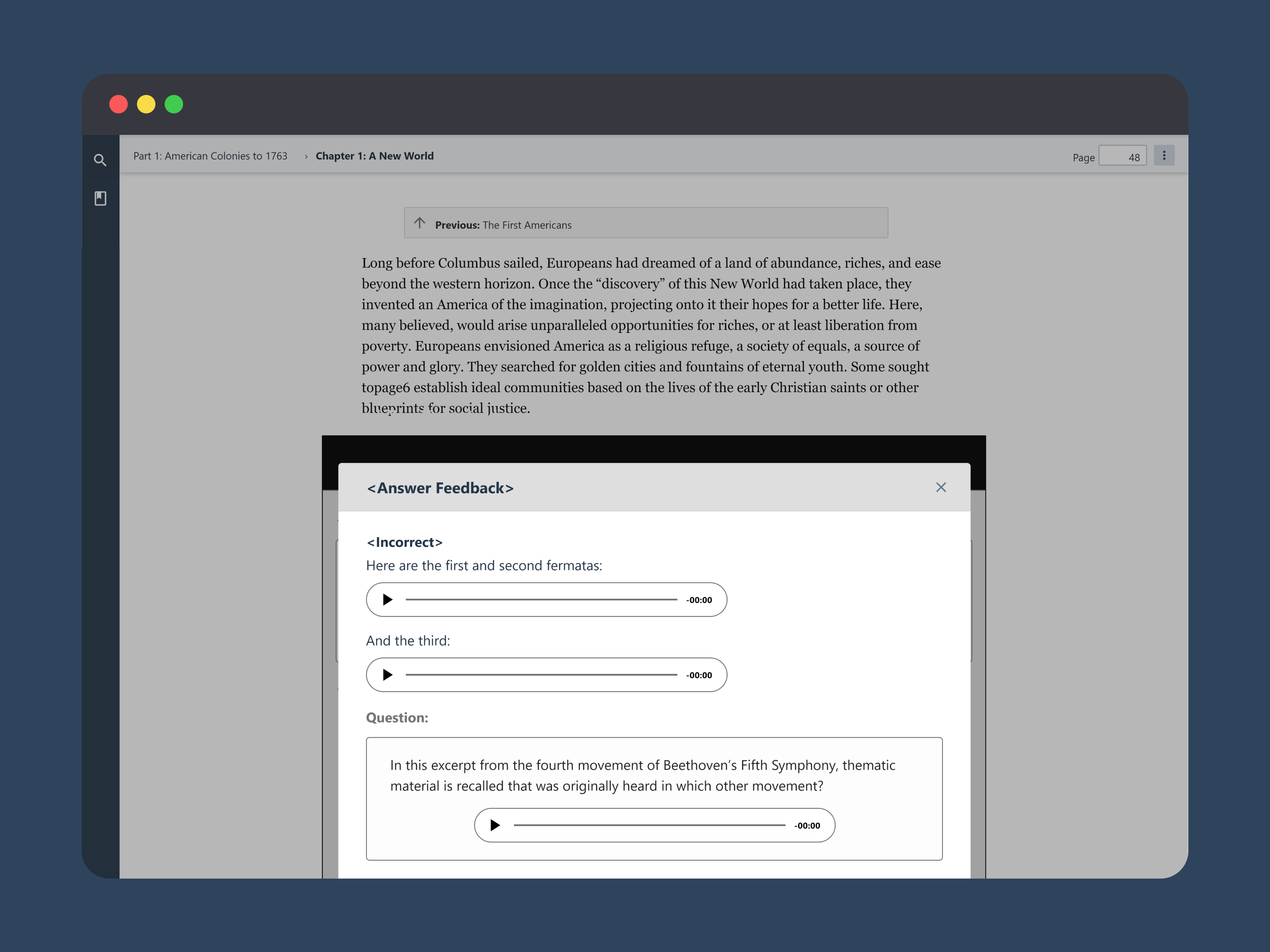
We decided to go with a feedback modal instead of showing the feedback in one spot of the frame. This is more accessible for screen readers as it provides a new screen for them to detect. Having a new screen displays feedback more clearly since it also takes up the entire frame. The modal would also prevent users from interacting with the rest of the ebook, to make sure users get the feedback and to prevent issues with completion.
Integration
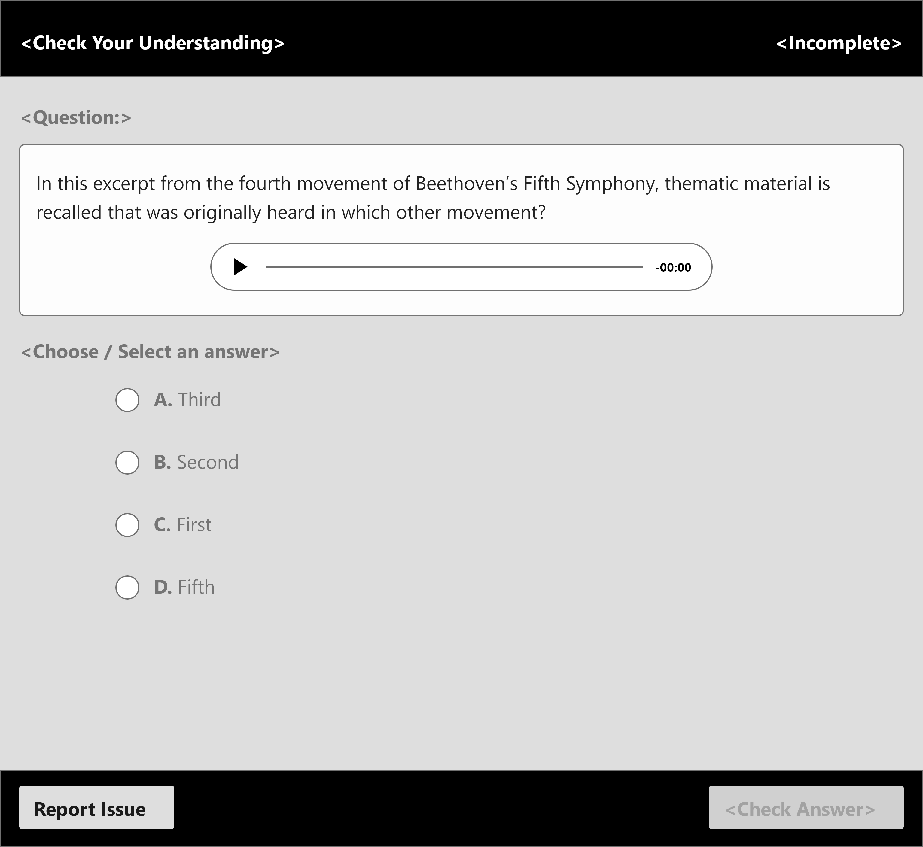
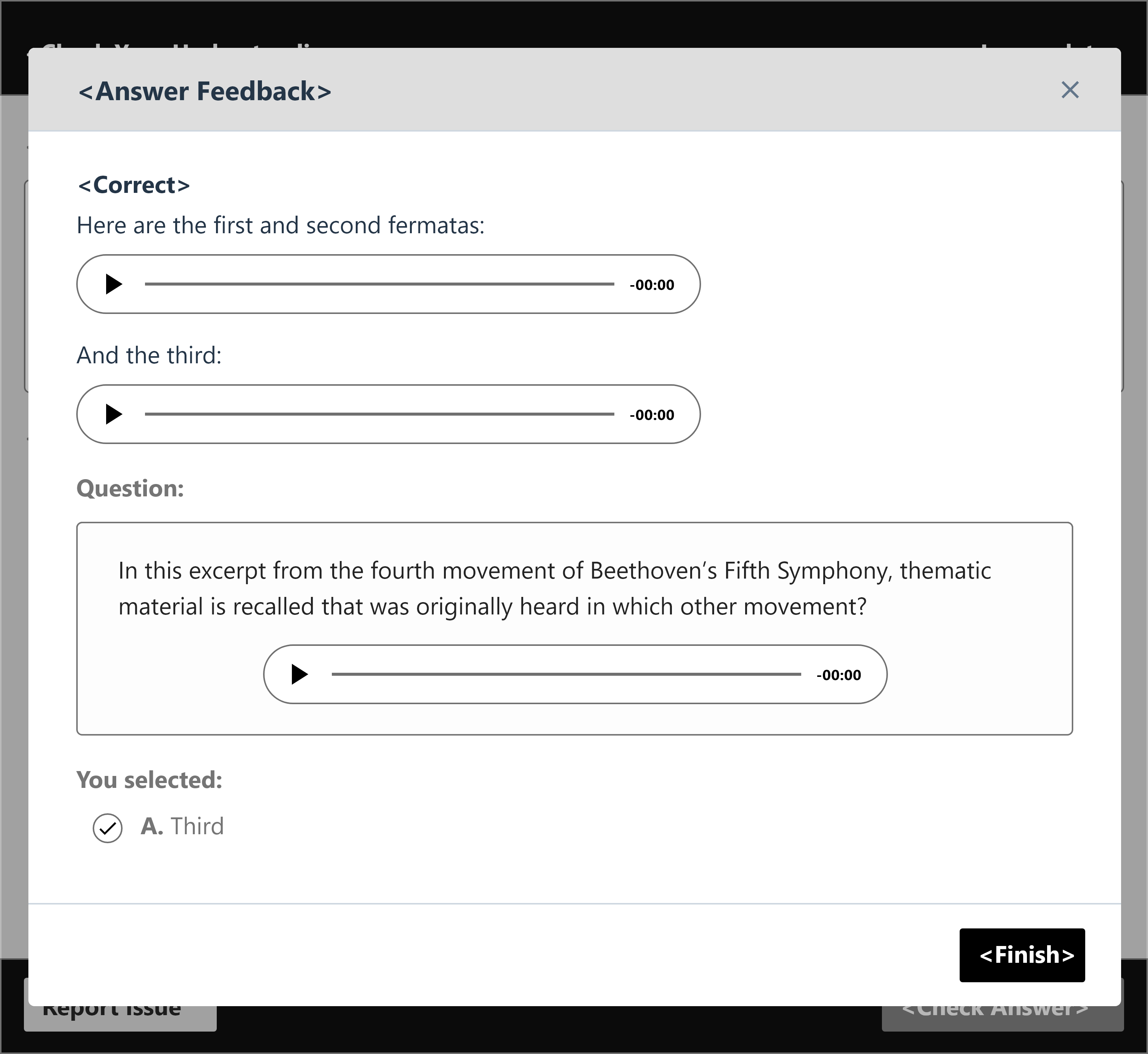
This is what the wireframes would look like integrated into the ebook. Our dedicated Visual Designer would finalize the UI for the designs.
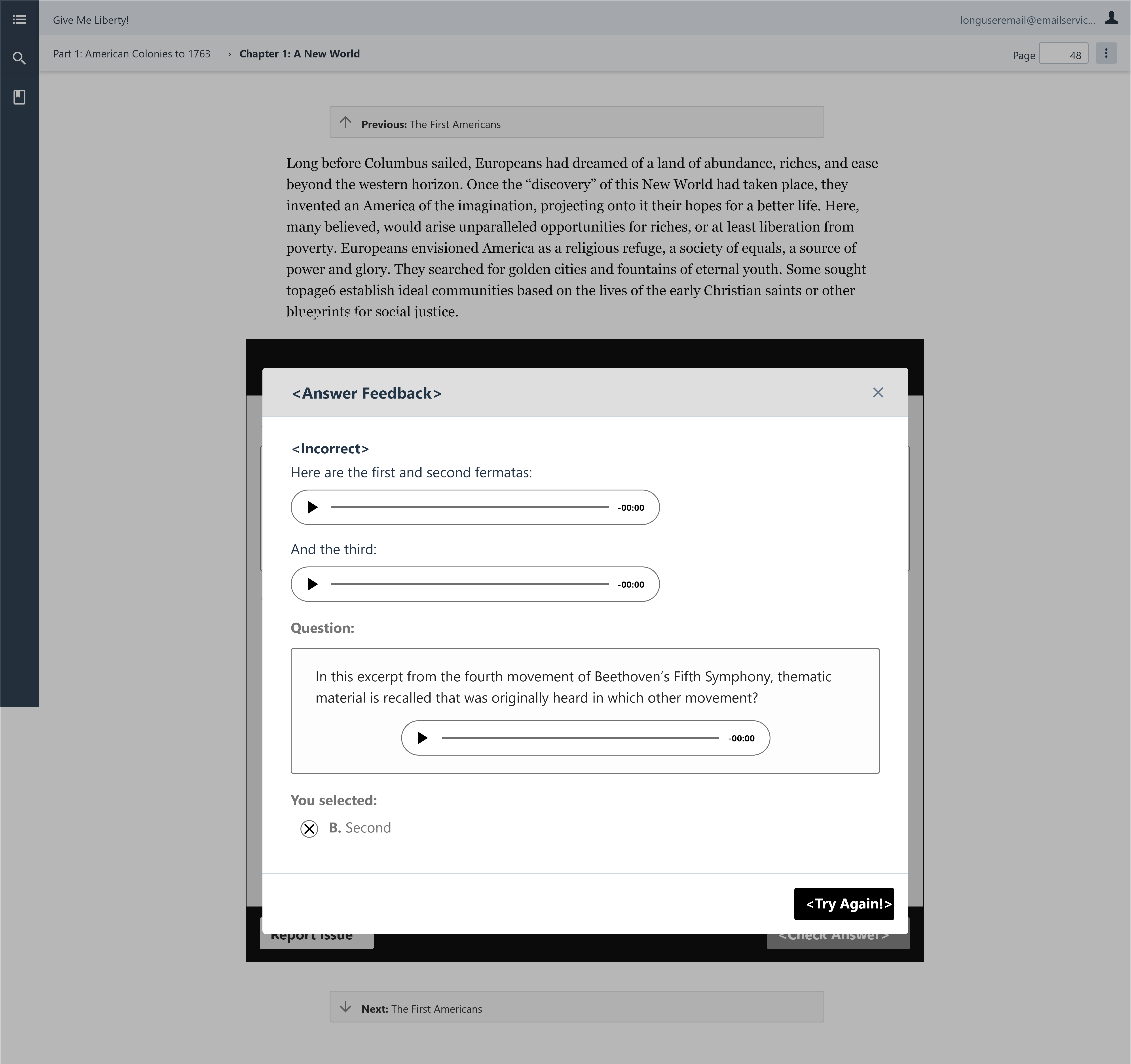
Figure 2. - An answer choice being checked. The feedback modal is displaying over the entire ebook.
I created a prototype to present the designs to the development team, to see if all our ideas were technically possible with the current product they've created. I also presented to the product owner to make sure we were fulfilling the user stories they gave us.
UI Spec
I had the chance to help write the UI specification for our dev team. I used Axure to annotate the wireframes and label each feature for the pages. I received guidance on my drafts to improve the descriptions.
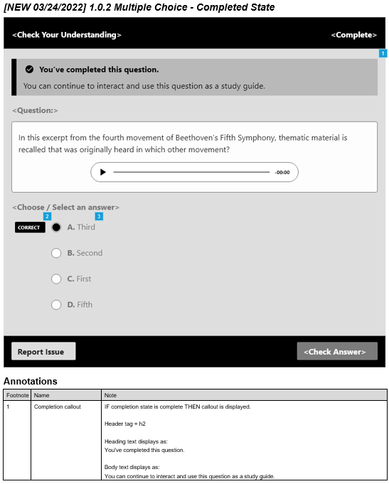
Figure 3. - An annotated page of the UI specification with a description at the bottom.
Usability Testing
With our time constraints for getting the rest of the Assignable Ebook's features for the MVP, we knew we wanted to test our current designs, not just the multiple choice questions, with 6 students. We gave ourselves about two weeks for recruiting and one week to conduct all six usability tests. I helped write the recruiting survey used to find the participants.
Recruiting Survey
Our recruiting survey was distributed to all student accounts upon loading their Norton Ebook for the first time. The survey ran for three days, from 04/15/22 - 04/18/22, and accumulated a total of 5,164 participants.
To find the appropriate participants for the study, we knew we wanted to ask about things like having assignments related to their current ebook. We also provided an optional open-ended question to see how descriptive they could be for a usability test. The survey was also used to see what kind of students in general were using the ebook, like what kind of classes they have, what other learning products they use, etc.
Results
Usability Testing
Some of the features we wanted to test included language within the frame, as well as navigating from a graded chapter in the ebook to the whole ebook, due to the LMS integration required. We also wanted to test the completion state of the multiple choice frame to see what would help students study when going back to a completed question. I also helped write the Usability testing script and thinking about the tasks we wanted to have users complete.
Results
We conducted 6 one-hour sessions. I analyzed some recordings afterward to answer some of the questions we had in our notes.
Before conducting the usability tests, I had some assumptions from my experience as a student using other LMS products. I was confused about some labels, like LMS badge specification. I was familiar with those types of products but I hadn't heard the name or acronym used before. Though I worked on the design for the multiple choice questions, I still thought users would also be able to understand the instructions and feedback well.
From the results, all users passed the multiple choice question tasks, though they struggled a bit trying to navigate to them in the ebook. Some of the changes we wanted to make though, had to do with the language used for the ebook, such as the confirmation modal, the LMS badge specification, and changing the assignment overview for clearer icons. We also wanted to reorganize the elements in the assignment overview so it would be easier to understand when all questions and activities were complete. I was surprised that users wanted to see different icons to understand the navigation though. It was because the icons had no label when the side navigation was closed, which goes back to what I learned about always using labels for icons.
Overall, the usability tests gave us a lot of good feedback and validation. All 6 users passed about 95% of the tasks, but there were still improvements we could make.
Reflection
The three months were very busy for the design team. I got to work on my ideation, wireframing, and prototyping skills while creating new concepts. I also learned how to write a UI specification, which I didn't have the opportunity of learning in the past. I really enjoyed getting to create a survey that fulfilled the purpose of getting new data about current users and also being used to help recruit study participants. Writing the Usability testing script was very extensive, but by looking back at all our requirements as well as coming together, we were able to write it in a short amount of time. Our study participants were all very thorough too.
Working to improve educational products for students was very fulfilling. As a recent student, I think I was able to bring a different perspective to the team. I also learned a lot from each team member and their specializations.
Tasks
- UX Design
- Prototyping
- UI Specification
- UX Research
Tools
- Adobe XD
- Axure
- Google Sheets